9 Tips for the Best E-commerce Cart Design for Your Store [+ Examples]
5 minutes
Table of Contents
Your online store’s success hinges on a good e-commerce cart design. A great shopping cart design helps your customers follow through on purchases. Considering that the current cart abandonment rate hovers around 70%, you want to do everything you can to make sure your customers purchase.
But what can you do about it?
In this article, we’re going to explore nine tips for the best e-commerce cart design for your store. We’ll look at examples of how you can create killer e-commerce shopping cart designs to entice your customers to purchase.
What is an E-commerce Shopping Cart?
In essence, an e-commerce shopping cart is the part of your online store that stores products the customer wishes to purchase. Without it, your customers would be unable to complete their purchases. They would need to use a third-party site to make their payment. However, your e-commerce shopping cart can also hamper your online store’s success.
How so?
Suppose your e-commerce site has a complicated shopping cart design. Customers struggle to understand how to use it, add items, and complete purchases. This situation would make it quite frustrating to complete a purchase. In fact, some studies reveal that 26% of shoppers abandon their carts due to a long checkout process. Now, 26% may not seem like a lot on the surface. But that’s money you’re leaving on the table.
A streamlined e-commerce shopping cart design can improve your e-commerce site’s overall performance. Plus, it can boost your sales conversions, driving your revenue in the process. You can see that a killer e-commerce cart design is something you don’t want to pass up.
How to Improve your E-commerce Shopping Cart Design?
So, the million-dollar question is: how can I improve my shopping cart design?
Here are five easy-to-use tips you can implement right away to improve your shopping cart design.
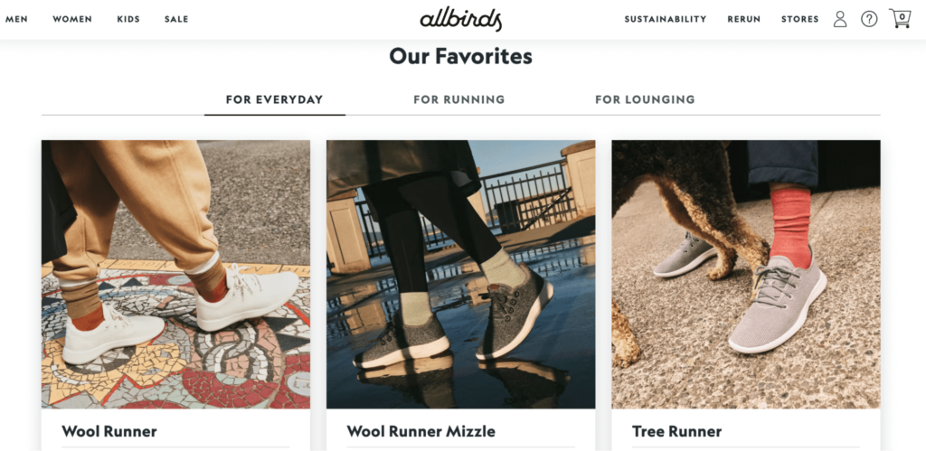
#1: Use the top-right corner
The best location to place your e-commerce cart icon or button is at the top-right corner. It’s a natural location for customers to spot it. While other shopping cart locations may include the right-middle of the screen, the top-right corner continues to be the most effective place to put your e-commerce cart icon.
Here’s an example:
Source: allbirds.com
As you can see, using the top-right corner seems natural. You don’t need to think about where the shopping cart icon is. We intuitively know where it is. So, don’t neglect the top right corner when looking for the best spot for your e-commerce shopping cart icon.
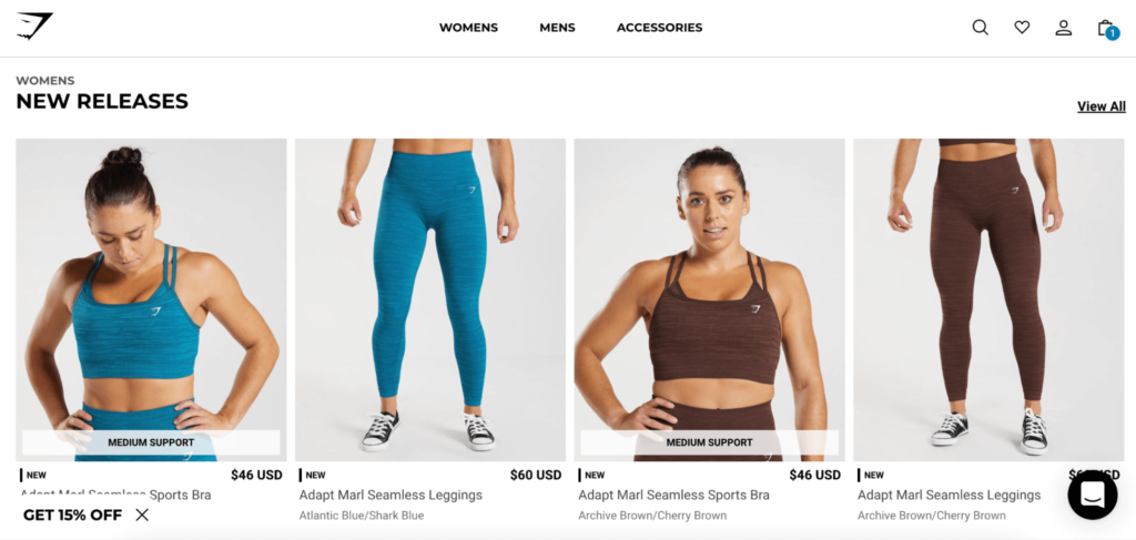
#2: Display the number of products in the cart
A great rule of thumb is to display the number of items in the shopping cart.
Why is this strategy important?
Please remember that customers don’t like surprises. Well, they like nice surprises. They don’t like realizing they added more items than they had thought. Moreover, customers like to keep track of their purchases. Consequently, displaying the number of items in the cart is a great way to help customers keep track of their purchases.
Let’s take a look at an example:
Source: gymshark.com
The example above highlights the usefulness of displaying the number of items in the cart. This tactic is important, especially when you have bundle deals such as BOGOs, buy-two-get-three, or other product kits where customers are purchasing multiple items. So, don’t forget about displaying items in the cart. You’ll be pleasantly surprised to find how much this tactic can help boost sales.
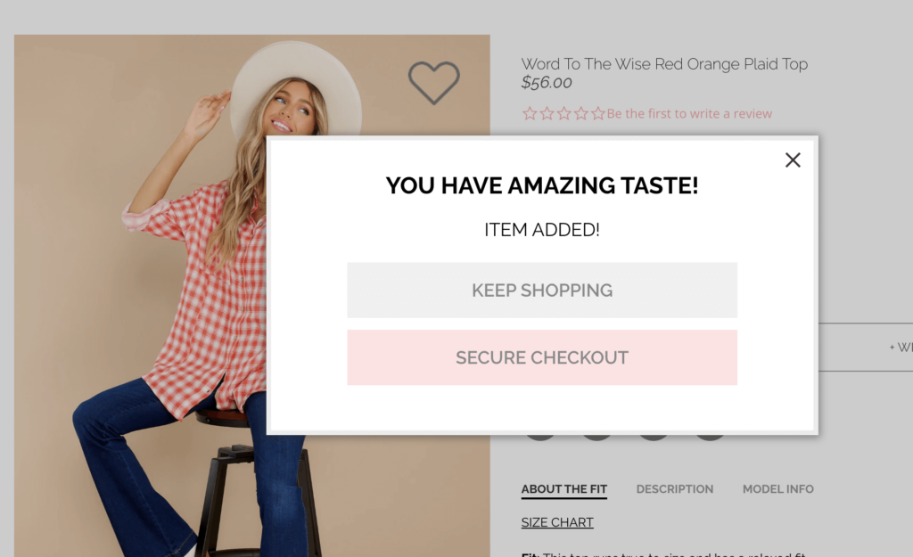
#3: Confirm added items
Remember we talked about surprises? Customers want to keep track of everything they do on your site. That includes receiving a confirmation when a product has been added to the shopping cart. In doing so, your customers can focus on the number of items they have added as they navigate your e-commerce site.
Here’s a look at a good example:
Source: reddress.com
In this example, we can see the message “Item Added!.” Plus, the message gives the customer some positive reinforcement, complimenting their taste, and also gives them the option of proceeding to the checkout page or continuing to browse more products. Customers often appreciate this flexibility.
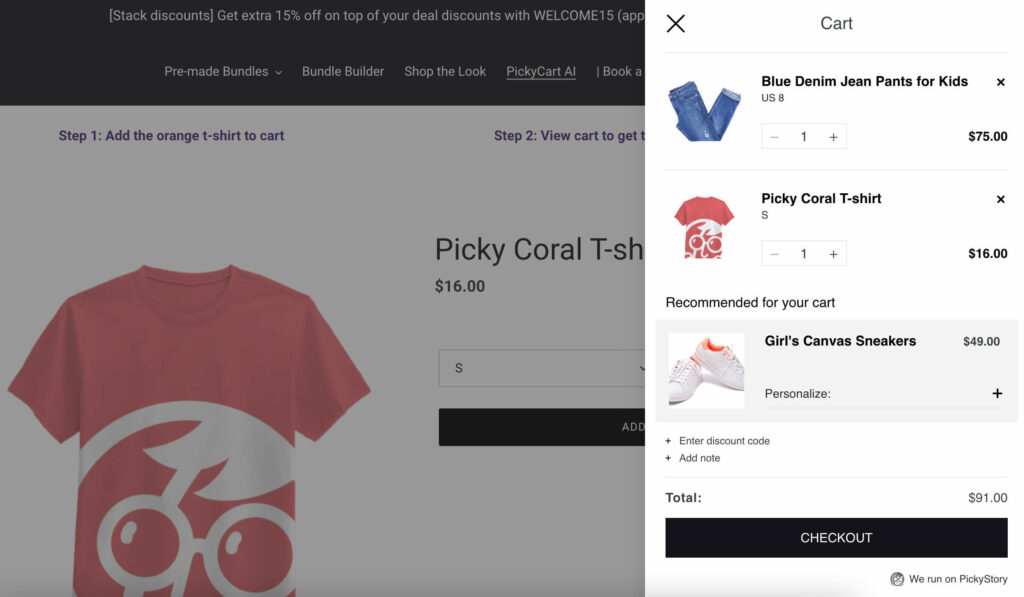
#4: Don’t neglect the cart drawer
Most e-commerce sites use a specific checkout page to complete purchases. However, slide carts and cart drawers have been on the rise in recent years.
So, what is a cart drawer?
A cart drawer is an e-commerce shopping cart design that pops up or slides out anywhere on the site. As a result, customers don’t need to navigate to a specific checkout page. All they need is to click on the icon or button to see the cart on the product page.
Here’s a good example:
Source: try.pickystory.com
This mini cart slides out from the right when the customer adds a product to their cart. This allows customers to view their cart, number of items, and value without leaving the product page.
Why is this important?
Think about it for a minute. If customers have to shift back and forth, they may lose their train of thought. That situation could result in missed sales. Therefore, you want to ensure that your customers never lose sight of the products they view.
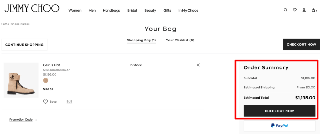
#5: Provide shipping information
According to Baymard, the top reason for cart abandonment is extra costs. Customers are aware of the cost of the products they are buying, but are often caught off guard by extra charges like shipping costs, taxes, and other fees.
What can you do about it, then?
Provide clear shipping information, including cost and delivery times.
Let’s have a look at a great example:
Source: jimmychoo.com
This shopping cart design example displays the estimated shipping fee for the order. Notice the phrase “from $0.”
What does this mean?
It means that customers can choose free shipping options. However, they’ll have to pay a little extra if they choose expedited shipping. That approach is fine as long as you are transparent about it.
Now that we’ve discussed five practical tips to improve your e-commerce shopping cart design let’s discuss ten great examples of e-commerce cart page designs.
9 Tips for the Best E-commerce Cart Design for Your Store
Here are the nine best e-commerce cart page design ideas you can use to create a killer shopping cart design for your site.
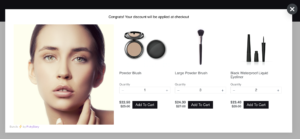
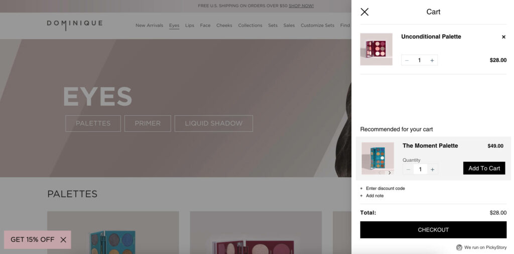
#1: In-cart recommendations
Leading off are in-cart recommendations. Using in-cart recommendations can greatly enhance your e-commerce cart page design. Product recommendations allow you to boost your average order value while giving your customers something truly important: options.
Here’s an example:
Source: dominiquecosmetics.com
This example gets it right because the cart displays a product recommendation that’s based on products the customer already has in their cart. By keeping your recommendations as relevant as possible, you have a greater chance of making a sale.
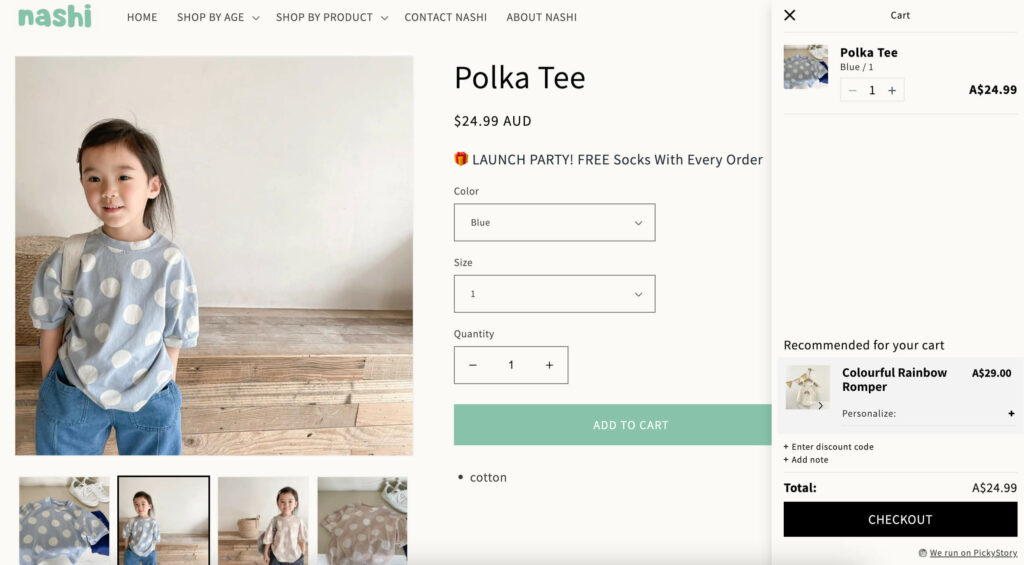
#2: Use a slide-out cart to highlight products
A slide-out cart is a great way to highlight products. In doing so, you give your customers the opportunity to view items, costs, and order value. Please remember that keeping your customers on product pages helps boost sales. In contrast, asking customers to leapfrog from one page to another may cause them to abandon their carts.
Here’s an example:
Source: nashikids.com.au
As you can see, this shopping cart design gets it right because it displays the product images, cost, and order value in a convenient slide-out cart. Plus, customers get shipping information as they navigate in the slide-out cart. All customers need to do is hit the “checkout” button to close the deal.
Don’t forget: simplifying things for customers is the best way you can ensure sales.
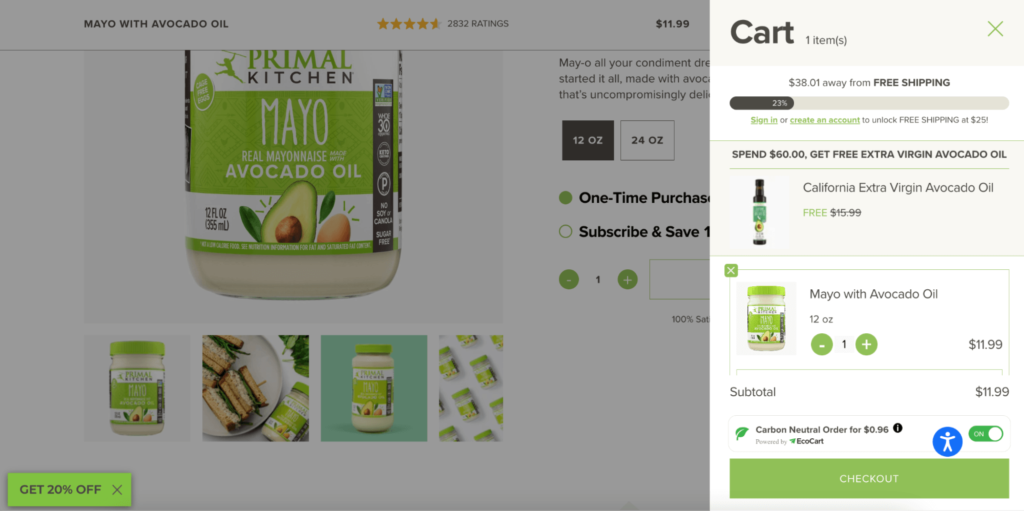
#3: Details, details, details
When it comes to your e-commerce site’s shopping cart, the more details, the better. You want to ensure your e-commerce cart design displays as much information as possible without cramming it. A nice, clean cart design helps improve visibility while ensuring your customers follow through.
Here’s an example:
Source: primalkitchen.com
This great e-commerce cart design shows all relevant product information. Additionally, it offers in-cart product recommendations. It’s not cluttered, but it is highly customizable and gives the customer a lot of useful information and additional deals if they choose to take them.
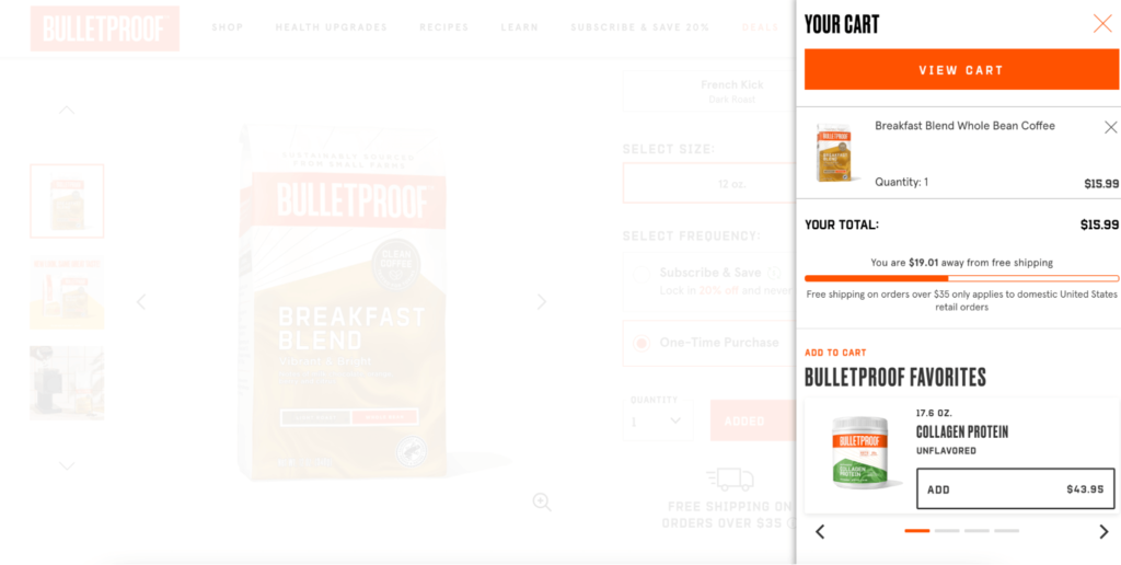
#4: Earn free shipping
Earning free shipping is a great way to boost your average order value. For instance, customers can qualify for free shipping when spending $20 or more. However, how can customers know when they’ve qualified?
Your e-commerce shopping cart design can indicate customers’ progress.
Here’s an example:
Source: shop.bulletproof.com
In this example, we can see a progress bar that helps customers visualize how much more they need to spend in order to qualify for free shipping. This tactic uses a powerful psychological principle. Specifically, people like to feel a sense of accomplishment. Adding the progress bar gives customers that sense of accomplishment while helping your boost your average order value.
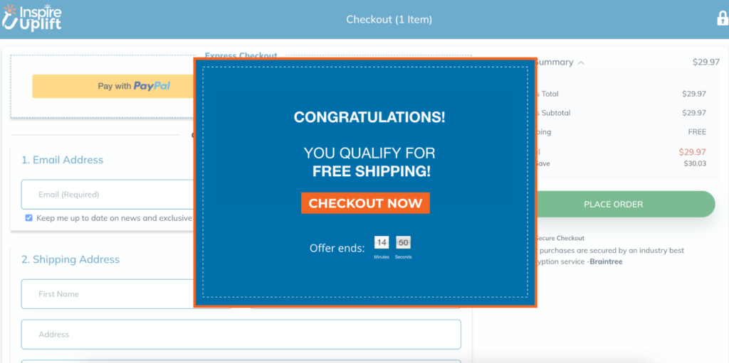
#5: A sense of urgency
Another highly powerful tactic is to create a sense of urgency. Creating this feeling compels customers to complete their purchase before time expires. The most common and effective way of implementing this approach is with a countdown timer.
Here’s an example:
Source: inspireuplift.com
Creating a sense of urgency triggers the fear of missing out. Missing out on a deal can compel customers to conclude their purchase sooner rather than later. After all, why risk missing out on a product you really want?
You can help create this sense by using a countdown timer. The time serves to place customers’ mindset into a specific timeframe. Countdown timers can become extremely powerful tools, particularly as a part of your e-commerce shopping cart page design, or as a popup on the cart or checkout page.
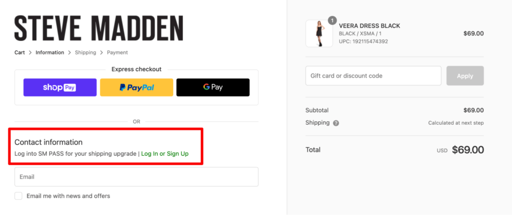
#6: The power of rewards
Rewards are a staple of customer loyalty programs. Many brands and e-commerce sites use rewards because they incentivize customers to purchase regularly. However, a reward is only good when customers get something good from them.
The smartest strategy is to use reward points. Points can allow customers to qualify for free items, discounts, or special perks. Displaying points in-cart helps customers visualize the benefit they get by purchasing.
Let’s take a look at a great shopping cart design example:
Source: stevemadden.com
The above example shows customers that they can save money and upgrade their shipping if they create an account. This is a strategy to encourage customers to checkout and complete their order, but it also helps the brand collect more details from each customer.
#7: Use free gifts
Like rewards, free gifts or samples allow you to incentivize customers. Free gifts can become a powerful way of upselling your customers. You can use a progress bar to unlock free gifts or rewards as an effective incentive tool. Also, you can include samples or gifts to promote a new item or brand.
Here’s an example:
Source: identixweb.com
This shopping cart design hits the nail on the head because it uses a progress bar to unlock a gift. Please remember that customers love to get a sense of accomplishment. The progress bar helps customers feel they get additional value for purchases they had already planned. Ultimately, using rewards such as gifts or samples provides your site with an unbeatable strategy.
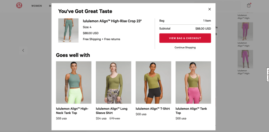
#8: Compliment your customers
There’s a subtle power in complimenting your customers on their good taste. After all, who doesn’t like to get compliments?
You can leverage the power of compliments on your e-commerce shopping cart by adding thoughtful notes when customers add products.
Let’s take a look at a great shopping cart design example:
Source: lululemon.com
A small note like “You’ve got great taste” puts a positive spin on your customers’ choices. These little touches show your customers how much you appreciate their business. It may not seem like a lot on the surface. In reality, these details go a long way toward building a positive relationship between your customers and brand.
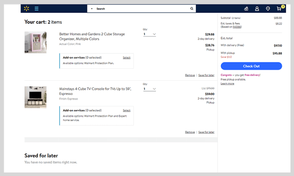
#9: Less is more
While we want to display as much information as possible, keeping things simple is a good rule of thumb. This reason underscores why we believe less is more. In particular, keeping your e-commerce shopping cart design clutter-free can significantly improve your sales conversions and revenue.
Let’s take a look at a great shopping cart design example:
Source: walmart.com
Walmart keeps things simple. They avoid overcrowding their checkout page by providing a nice, clean layout. It’s a great rule of thumb to keep your e-commerce shopping cart design as open as possible. The last thing you want is needless distractions. It’s best to ensure that customers focus on following through on their purchases.
All in all, a simple and functional layout will always get you ahead of the game. With these great e-commerce shopping cart designs, you have a great head start on your competitors.
Use PickyStory's PickyCart for a Clean E-commerce Cart Design + Upsells
PickyStory’s PickyCart is an advanced slide cart that’s available as part of the PickyStory platform. The cart has a simple, clean design that highlights the products that have been added, and also allows you to offer AI-based recommendations in the cart, encouraging your customers to add more products to their order.
Offering upsell and cross-sell deals in the cart is an effective way of increasing your revenue, because it’s at a time when your customers are close to making a purchase. Try PickyStory’s PickyCart in your store and sell more products to each customer.
Present bundles of products that are frequently purchased together, simplifying the decision-making process for your customers
What is Frequently Bought Together?
It is a recommendation scenario that suggests additional products to the shopper, which are often purchased by other customers in conjunction with the item they are currently viewing or considering purchasing.
Why are brands using it?
Boosted sales and revenue - increases average order value by suggesting complementary products, leading to higher sales
Simplified customer experience - saves time and effort for customers by offering relevant product recommendations, enhancing satisfaction and loyalty
Cross-selling opportunities: "Frequently Bought Together" creates opportunities for cross-selling, allowing brands to introduce shoppers to a wider range of products
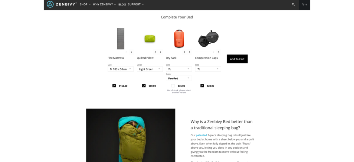
How Zenbivy uses Frequently Bought Together
Zenbivy simplifies the shopping experience by displaying all the needed pieces of its sleeping systems on one page, under each product that is part of a sleeping system. This way, shoppers don't need to go through multiple pages and guess what goes with what. Zenbivy enjoys much larger orders, and shoppers can have a seamless experience.
Offer shoppers the ability to create their own bundle of products by selecting from a range of available options
What is Build Your Own Bundle?
Build Your Own Bundle scenario provides shoppers with the flexibility to select specific items or features that best meet their individual needs and preferences. The selection is based on a pre-curated set of products by the merchant.
Why are brands using it?
Increase AOV - encourage higher spending with customizable bundles, raising average order values and revenue
Personalize purchases - tailor products to customer preferences, potentially increasing Average Order Value (AOV) and overall revenue
Stand out competitively - offer a unique option, attracting customers looking for customized solutions
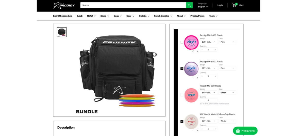
How Prodigy uses Build Your Own Bundle
Prodigy enables its shoppers to build their own bundle of golf discs, fully personalizing the shopping experience. Shoppers get an easy way to select their favorite discs while Prodigy consistently increases its AOV.
Combine multiple individual products into a bundle and sell them as a single unit
What is Bundle as Product?
Bundle as Product scenario involves bundling multiple individual products together and selling them as a single unit. This strategy offers shoppers a curated selection of items that work together or complement each other.
Why are brands using it?
Increase sales and revenue. Bundling leads to higher sales volumes and greater revenue due to the perceived cost-effectiveness.
Highlight the value and convenience of purchasing a set of items together, enticing them with an irresistible offer
Enhance value perception. Bundles create the perception of added value, making them more appealing to customers.
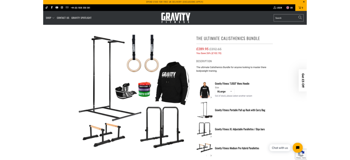
How Gravity Fitness uses Bundle as Product
Gravity Fitness knows that it's not an easy task for shoppers to collect all the required pieces for a complete home gym. That's why they have created pre-made home gym bundles for an easy shopping experience. Now they have fewer SKU issues, a higher AOV, and happier customers.
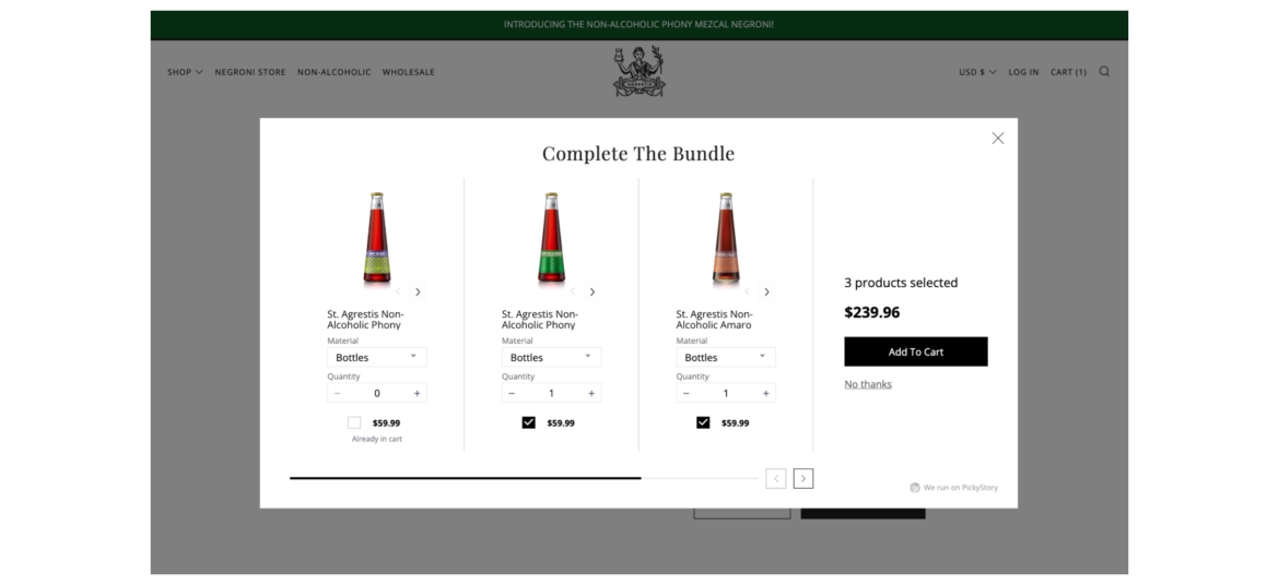
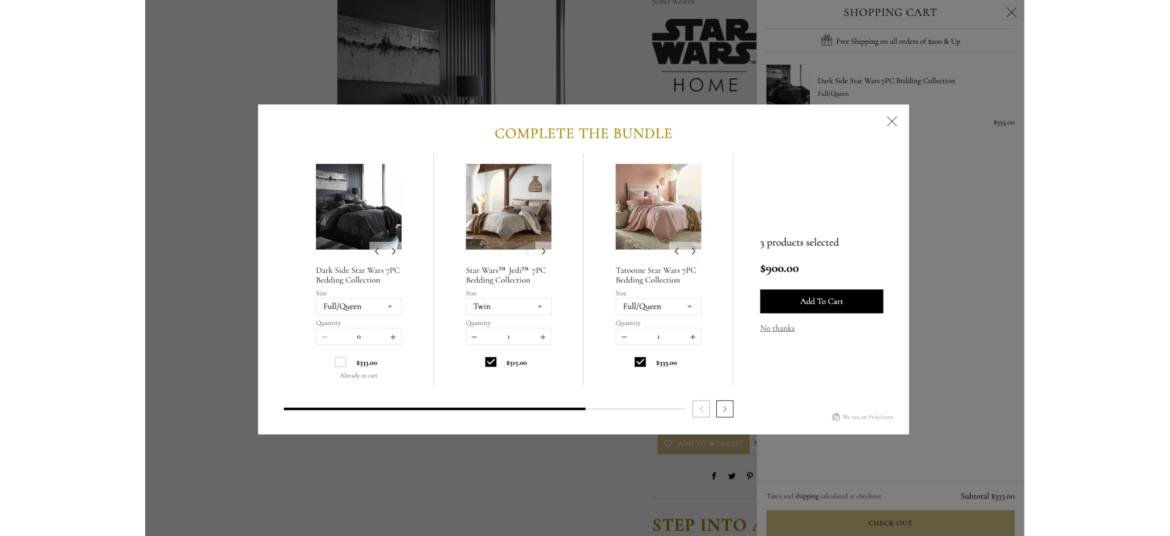
Encourage shoppers to add the missing items to complete the bundle when they add items to cart
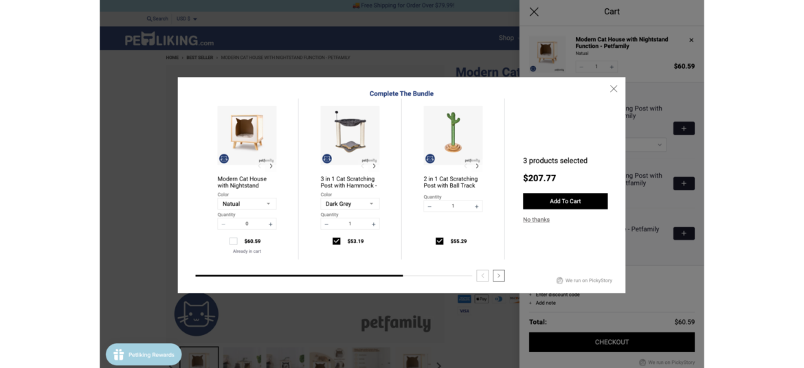
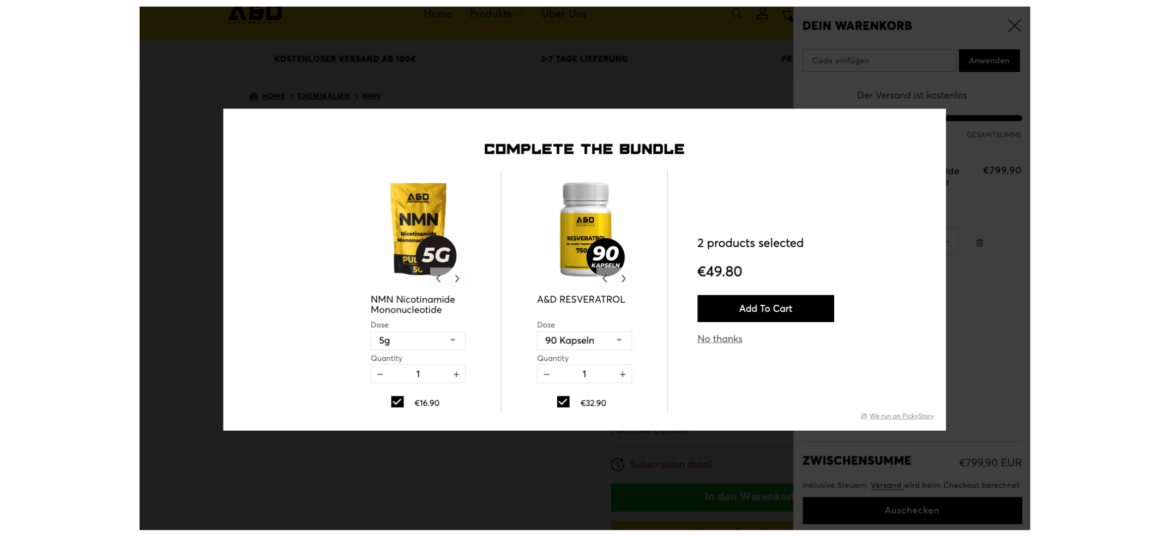
What is Complete the Bundle?
Complete the Bundle popup is a deal that appears when a shopper has added some items to their shopping cart but has not yet added all the recommended or related products that typically go together.
Why are brands using it?
Increase Average Order Value (AOV) - encourage shoppers to add complementary products, leading to higher total purchases
Highlight the value and convenience of purchasing a set of items together, enticing them with an irresistible offer
Enhance value perception. Bundles create the perception of added value, making them more appealing to customers.
How Petliking.com uses Complete the Bundle
Petliking.com never misses an opportunity to offer more products to its shoppers after they add an item to cart. By offering to complete the bundle, Petliking.com helps shoppers to discover additional related items that complement each other while increasing its order size.
Combine multiple individual products into a bundle and sell them as a single unit
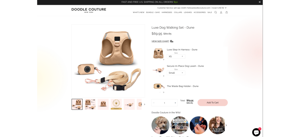
What is Bundle as Product?
Bundle as Product scenario involves bundling multiple individual products together and selling them as a single unit. This strategy offers shoppers a curated selection of items that work together or complement each other.
Why are brands using it?
Increase sales and revenue. Bundling leads to higher sales volumes and greater revenue due to the perceived cost-effectiveness.
Highlight the value and convenience of purchasing a set of items together, enticing them with an irresistible offer
Enhance value perception. Bundles create the perception of added value, making them more appealing to customers.
How Doodle Couture uses Bundle as Product
Doodle Couture makes it so easy for shoppers to equip their best friend with the required outfit. Instead of moving back and forth between pages, Doodle Couture offer a complete bundle for pets on one page with a single click. This boosts AOV while making the shopper happy.
Encourage shoppers to add the missing items to complete the bundle when they add items to cart
What is Complete the Bundle?
Complete the Bundle popup is a deal that appears when a shopper has added some items to their shopping cart but has not yet added all the recommended or related products that typically go together.
Why are brands using it?
Increase Average Order Value (AOV) - encourage shoppers to add complementary products, leading to higher total purchases
Highlight the value and convenience of purchasing a set of items together, enticing them with an irresistible offer
Enhance value perception. Bundles create the perception of added value, making them more appealing to customers.
How A&D Performance uses Complete the Bundle
A&D Performance always seizes intent-based opportunities to offer additional supplements when shoppers add items to their cart. By displaying a 'Complete the Bundle' popup, A&D Performance increases their Average Order Value (AOV) while helping their customers discover more products.
Combine multiple individual products into a bundle and sell them as a single unit
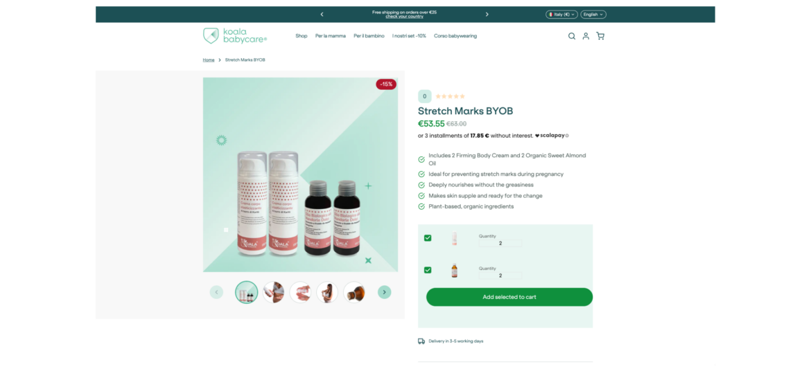
What is Bundle as Product?
Bundle as Product scenario involves bundling multiple individual products together and selling them as a single unit. This strategy offers shoppers a curated selection of items that work together or complement each other.
Why are brands using it?
Increase sales and revenue. Bundling leads to higher sales volumes and greater revenue due to the perceived cost-effectiveness.
Highlight the value and convenience of purchasing a set of items together, enticing them with an irresistible offer
Enhance value perception. Bundles create the perception of added value, making them more appealing to customers.
How Koala Babycare uses Bundle as Product
Koala Babycare simplifies its shoppers lives by offering complete cream & oil sets. Shoppers can easily pick their favorite bundles and save while Koala Babycare increases its AOV and number of orders.
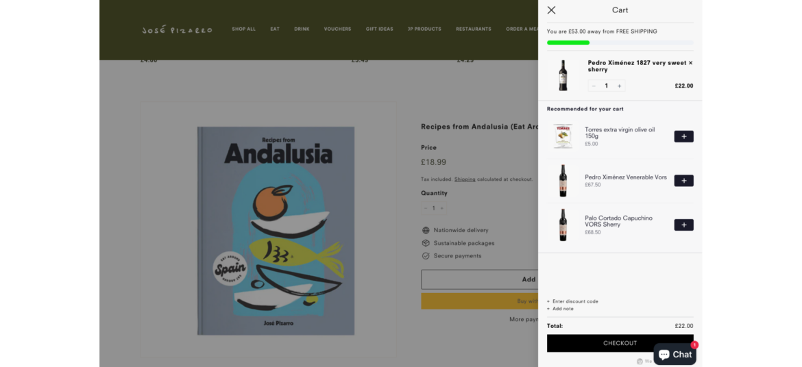
Encourage shoppers to spend a certain amount of money (X) in order to receive a specific benefit or reward (Y)
What is Spend X Get Y?
"Spend X, Get Y" promotions are designed to motivate shoppers to spend more money with the promise of receiving something valuable in return. It's a win-win situation where customers get a benefit, and the store increases its sales.
Why are brands using it?
Promotes larger purchases - motivates shoppers to spend more to qualify for the promotion, potentially leading to bigger transactions
Increases Average Order Value (AOV) - encourages higher spending, leading to a higher average transaction value
Jose Pizarro takes advantage of PickyCart and 'Spend X Get Y' to reward shoppers with free shipping when they spend £75 in-store. This is a win-win offer for both sides - while Jose Pizarro increases the AOV, shoppers receive a sweet reward.
Encourage shoppers to add the missing items to complete the bundle when they add items to cart
What is Complete the Bundle?
Complete the Bundle popup is a deal that appears when a shopper has added some items to their shopping cart but has not yet added all the recommended or related products that typically go together.
Why are brands using it?
Increase Average Order Value (AOV) - encourage shoppers to add complementary products, leading to higher total purchases
Highlight the value and convenience of purchasing a set of items together, enticing them with an irresistible offer
Enhance value perception. Bundles create the perception of added value, making them more appealing to customers.
How Agrestis uses Complete the Bundle
Agrestis makes sure to consistently display a variety of spirits to their shoppers at the right moment. As shoppers add spirits to the cart, Agrestis extends an offer to include more related spirits, resulting in an improved shopping experience and a higher Average Order Value (AOV).
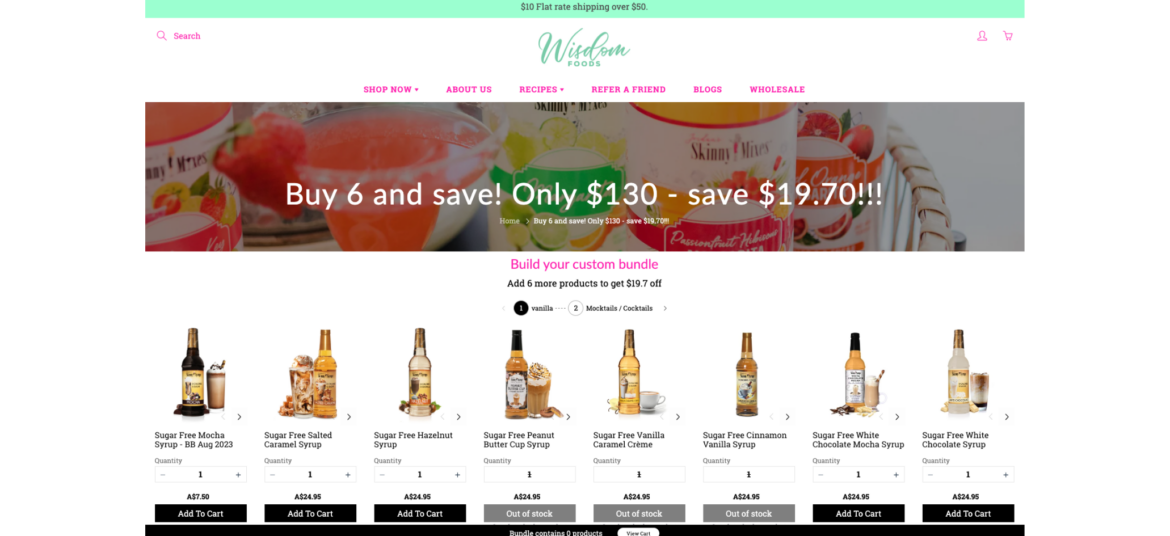
Offer shoppers the ability to create their own bundle of products by selecting from a range of available options
What is Build Your Own Bundle?
Build Your Own Bundle scenario provides shoppers with the flexibility to select specific items or features that best meet their individual needs and preferences. The selection is based on a pre-curated set of products by the merchant.
Why are brands using it?
Increase AOV - encourage higher spending with customizable bundles, raising average order values and revenue
Personalize purchases - tailor products to customer preferences, potentially increasing Average Order Value (AOV) and overall revenue
Stand out competitively - offer a unique option, attracting customers looking for customized solutions
How Wisdom Foods uses Build Your Own Bundle
Wisdom Foods wanted to upgrade its shopping experience by making it easy for shoppers to pick their desired syrups. Now it allows shoppers to build their own bundles of syrups from a single page and checking out. This increases Wisdom Foods' order sizes while providing a personalized experience to their shoppers.
Combine multiple individual products into a bundle and sell them as a single unit
What is Bundle as Product?
Bundle as Product scenario involves bundling multiple individual products together and selling them as a single unit. This strategy offers shoppers a curated selection of items that work together or complement each other.
Why are brands using it?
Increase sales and revenue. Bundling leads to higher sales volumes and greater revenue due to the perceived cost-effectiveness.
Highlight the value and convenience of purchasing a set of items together, enticing them with an irresistible offer
Enhance value perception. Bundles create the perception of added value, making them more appealing to customers.
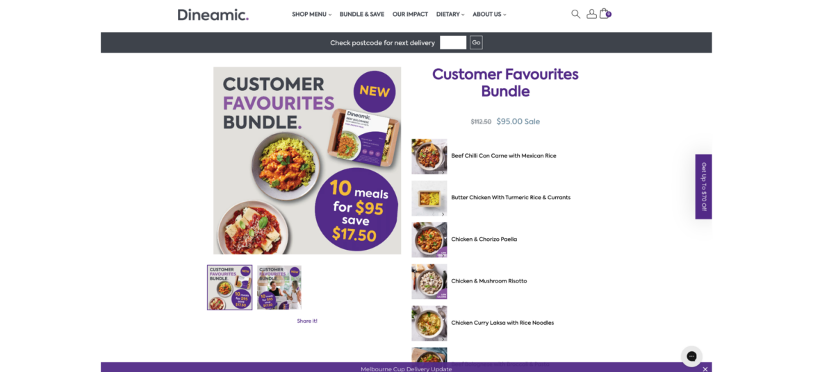
How Dineamic uses Bundle as Product
Dineamic takes advantage of bundles to package their pre-made meals by dietary requirements, so every shopper can quickly and easily find the desired category of meals and add them all with a single click. This simplifies the shopping experience and benefits both sides, as Dineamic boosts its Average Order Value (AOV).
Combine multiple individual products into a bundle and sell them as a single unit
What is Bundle as Product?
Bundle as Product scenario involves bundling multiple individual products together and selling them as a single unit. This strategy offers shoppers a curated selection of items that work together or complement each other.
Why are brands using it?
Increase sales and revenue. Bundling leads to higher sales volumes and greater revenue due to the perceived cost-effectiveness.
Highlight the value and convenience of purchasing a set of items together, enticing them with an irresistible offer
Enhance value perception. Bundles create the perception of added value, making them more appealing to customers.
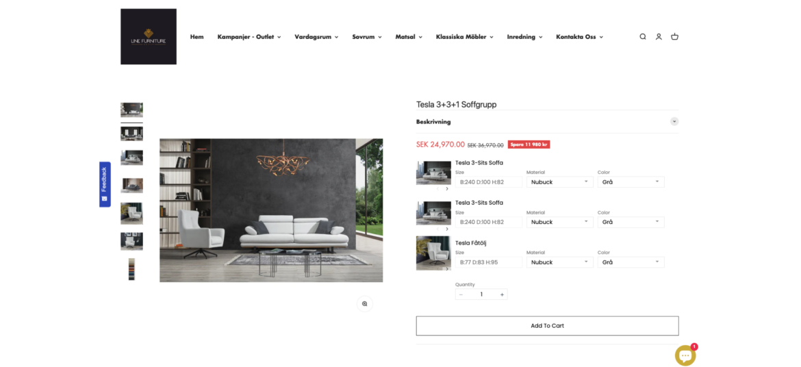
How Line Furniture uses Bundle as Product
Line furniture simplifies its shoppers lives by offering complete furniture sets in different styles. Now shoppers can easily find their favorite living room and save while Line Furniture increases its AOV and number of orders.
Encourage shoppers to add the missing items to complete the bundle when they add items to cart
What is Complete the Bundle?
Complete the Bundle popup is a deal that appears when a shopper has added some items to their shopping cart but has not yet added all the recommended or related products that typically go together.
Why are brands using it?
Increase Average Order Value (AOV) - encourage shoppers to add complementary products, leading to higher total purchases
Highlight the value and convenience of purchasing a set of items together, enticing them with an irresistible offer
Enhance value perception. Bundles create the perception of added value, making them more appealing to customers.
How Sobel Home uses Complete the Bundle
Sobel Home never misses an opportunity to offer more products to its shoppers after they add an item to cart. By offering to complete the bundle, Sobel Home helps shoppers to discover additional related items that complement each other while increasing its order size.
Present bundles of products that are frequently purchased together, simplifying the decision-making process for your customers
What is Frequently Bought Together?
It is a recommendation scenario that suggests additional products to the shopper, which are often purchased by other customers in conjunction with the item they are currently viewing or considering purchasing.
Why are brands using it?
Boosted sales and revenue - increases average order value by suggesting complementary products, leading to higher sales
Simplified customer experience - saves time and effort for customers by offering relevant product recommendations, enhancing satisfaction and loyalty
Cross-selling opportunities: "Frequently Bought Together" creates opportunities for cross-selling, allowing brands to introduce shoppers to a wider range of products
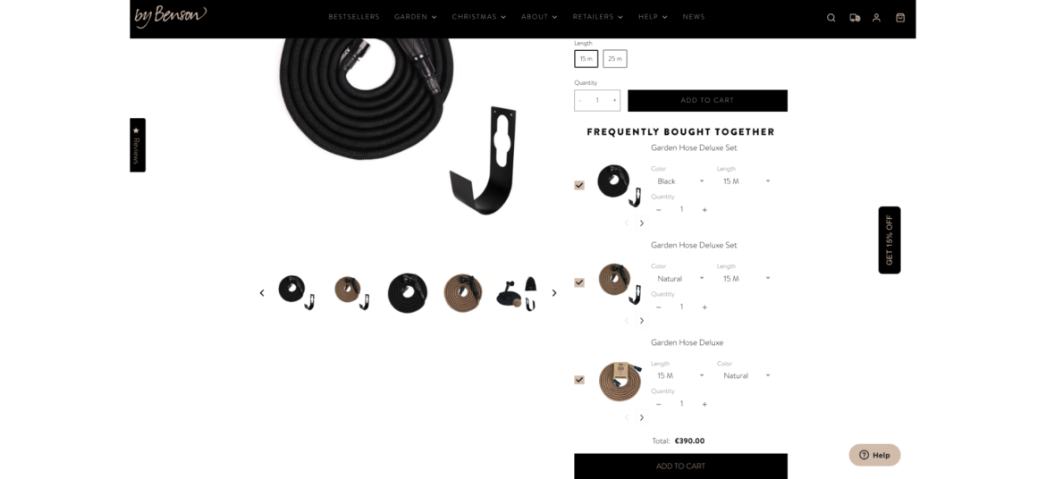
How By Benson uses Frequently Bought Together
By Benson never misses an opportunity to offer more options to its customers. While shoppers visit their product pages, they constantly offer to extend or upgrade the targeted product, resulting in better service and larger orders.
Offer shoppers the ability to create their own bundle of products by selecting from a range of available options
What is Build Your Own Bundle?
Build Your Own Bundle scenario provides shoppers with the flexibility to select specific items or features that best meet their individual needs and preferences. The selection is based on a pre-curated set of products by the merchant.
Why are brands using it?
Increase AOV - encourage higher spending with customizable bundles, raising average order values and revenue
Personalize purchases - tailor products to customer preferences, potentially increasing Average Order Value (AOV) and overall revenue
Stand out competitively - offer a unique option, attracting customers looking for customized solutions
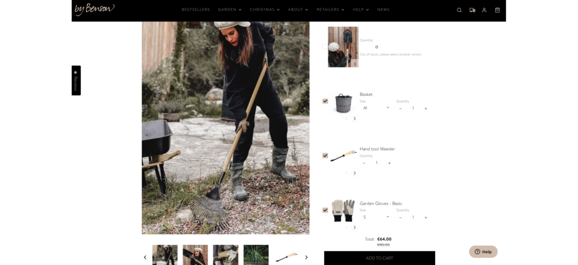
How By Benson uses Build Your Own Bundle
As a professional destination for home gardeners, By Benson understands that it might be tricky to select all the necessary tools to make your garden shine. That's why By Benson helps its shoppers choose bundles of tools with a single click, while boosting their Average Order Value (AOV).
Offer shoppers the ability to create their own bundle of products by selecting from a range of available options
What is Build Your Own Bundle?
Build Your Own Bundle scenario provides shoppers with the flexibility to select specific items or features that best meet their individual needs and preferences. The selection is based on a pre-curated set of products by the merchant.
Why are brands using it?
Increase AOV - encourage higher spending with customizable bundles, raising average order values and revenue
Personalize purchases - tailor products to customer preferences, potentially increasing Average Order Value (AOV) and overall revenue
Stand out competitively - offer a unique option, attracting customers looking for customized solutions
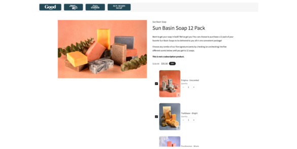
How Good Store uses Build Your Own Bundle
Good Store encourages its shoppers to build their own custom bundles of soaps. They provide a variety of soaps to choose from and leave the selection itself to the shopper. This is fun, rewarding, and makes both sides happy.
Combine multiple individual products into a bundle and sell them as a single unit
What is Bundle as Product?
Bundle as Product scenario involves bundling multiple individual products together and selling them as a single unit. This strategy offers shoppers a curated selection of items that work together or complement each other.
Why are brands using it?
Increase sales and revenue. Bundling leads to higher sales volumes and greater revenue due to the perceived cost-effectiveness.
Highlight the value and convenience of purchasing a set of items together, enticing them with an irresistible offer
Enhance value perception. Bundles create the perception of added value, making them more appealing to customers.
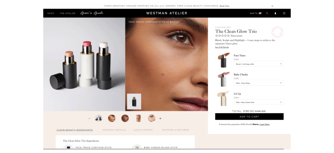
How Westman Atelier uses Bundle as Product
Westman Atelier understands that the attention span of the average shopper is quite short. Furthermore, with numerous options available, it's often easier to opt for a suggested bundle that's already curated for you.
Present bundles of products that are frequently purchased together, simplifying the decision-making process for your customers
What is Frequently Bought Together?
It is a recommendation scenario that suggests additional products to the shopper, which are often purchased by other customers in conjunction with the item they are currently viewing or considering purchasing.
Why are brands using it?
Boosted sales and revenue - increases average order value by suggesting complementary products, leading to higher sales
Simplified customer experience - saves time and effort for customers by offering relevant product recommendations, enhancing satisfaction and loyalty
Cross-selling opportunities: "Frequently Bought Together" creates opportunities for cross-selling, allowing brands to introduce shoppers to a wider range of products
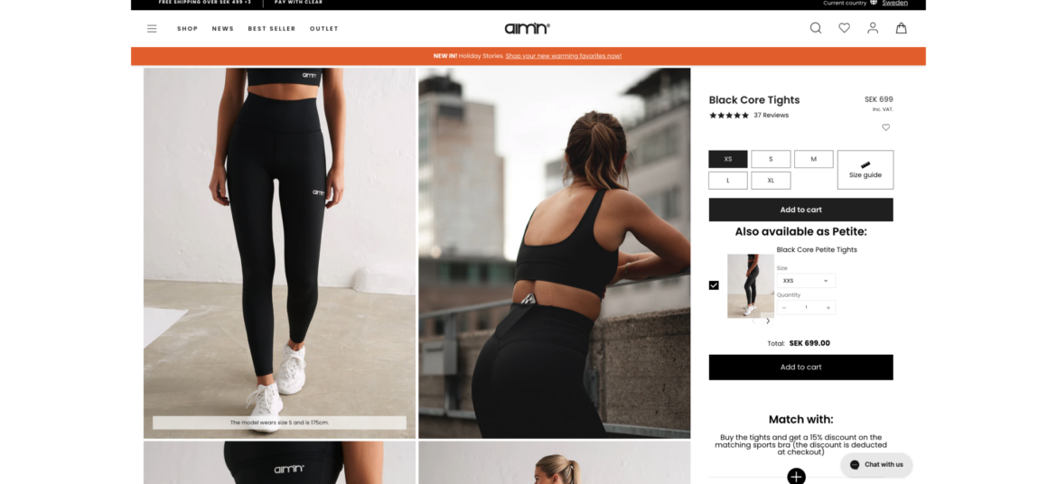
How Aim’n uses Frequently Bought Together
Aim'n never misses a shopper when it comes to its product pages. It utilizes the 'Frequently Bought Together' feature to suggest additional sizes to product viewers, ensuring that no shopper is left without a solution while keeping its main sizes as the default option.
Combine multiple individual products into a bundle and sell them as a single unit
What is Bundle as Product?
Bundle as Product scenario involves bundling multiple individual products together and selling them as a single unit. This strategy offers shoppers a curated selection of items that work together or complement each other.
Why are brands using it?
Increase sales and revenue. Bundling leads to higher sales volumes and greater revenue due to the perceived cost-effectiveness.
Highlight the value and convenience of purchasing a set of items together, enticing them with an irresistible offer
Enhance value perception. Bundles create the perception of added value, making them more appealing to customers.
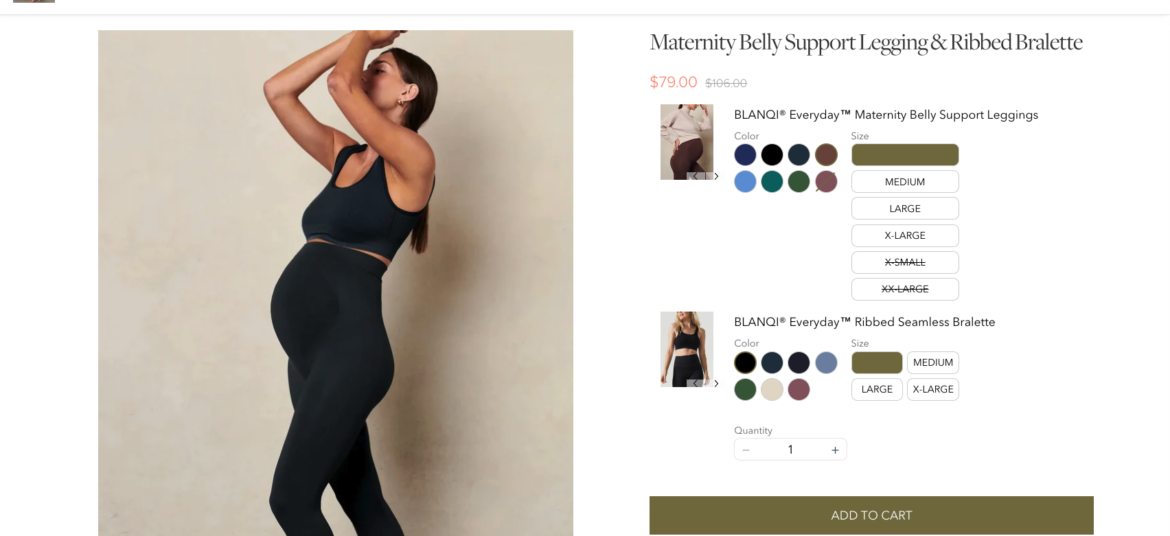
How BLANQI uses Bundle as Product
BLANQI make it easy for their shoppers to find complete maternity sets. While shoppers receive a fast, single-click shopping experience, BLANQI enjoys higher order amounts without investing any additional resources.
Offer shoppers the ability to create their own bundle of products by selecting from a range of available options
What is Build Your Own Bundle?
Build Your Own Bundle scenario provides shoppers with the flexibility to select specific items or features that best meet their individual needs and preferences. The selection is based on a pre-curated set of products by the merchant.
Why are brands using it?
Increase AOV - encourage higher spending with customizable bundles, raising average order values and revenue
Personalize purchases - tailor products to customer preferences, potentially increasing Average Order Value (AOV) and overall revenue
Stand out competitively - offer a unique option, attracting customers looking for customized solutions
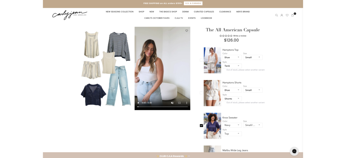
How Carly Jean uses Build Your Own Bundle
Carly Jean offers its shoppers the opportunity to build their own custom looks by selecting the individual items that comprise their desired outfit. 'Build Your Own Bundle' enables Carly Jean to easily provide a personalized experience that shoppers love and want to return to again and again.
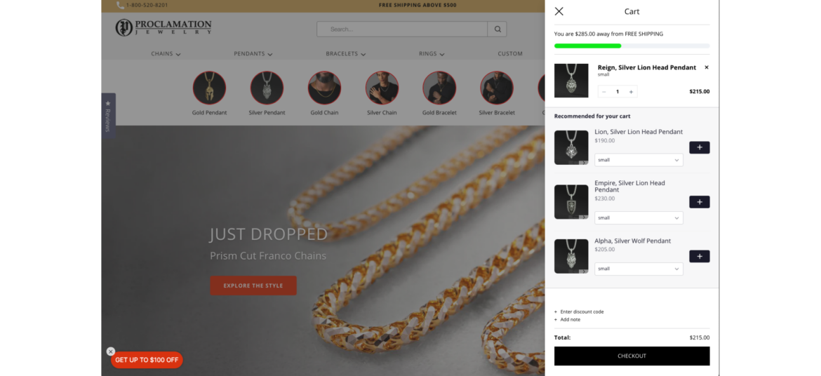
Encourage shoppers to spend a certain amount of money (X) in order to receive a specific benefit or reward (Y)
What is Spend X Get Y?
"Spend X, Get Y" promotions are designed to motivate shoppers to spend more money with the promise of receiving something valuable in return. It's a win-win situation where customers get a benefit, and the store increases its sales.
Why are brands using it?
Promotes larger purchases - motivates shoppers to spend more to qualify for the promotion, potentially leading to bigger transactions
Increases Average Order Value (AOV) - encourages higher spending, leading to a higher average transaction value
Proclamation Jewelry encourages its shoppers to spend at least $500 on jewelry in-store to receive free shipping. This is a win-win for both the shoppers, who get free shipping (which can be expensive at times), and the brand, which maintains a higher average order value.