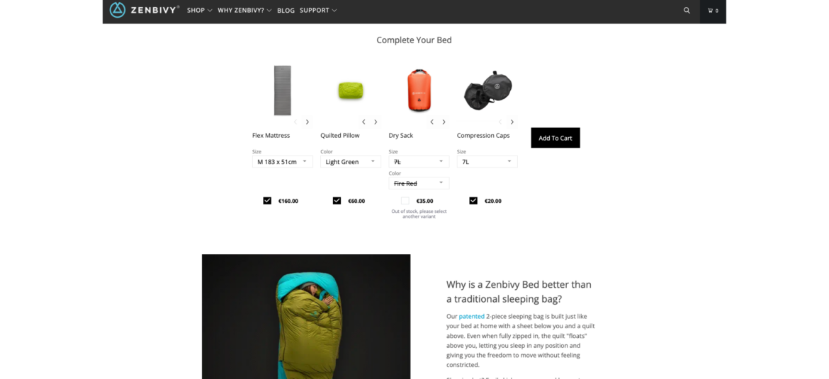
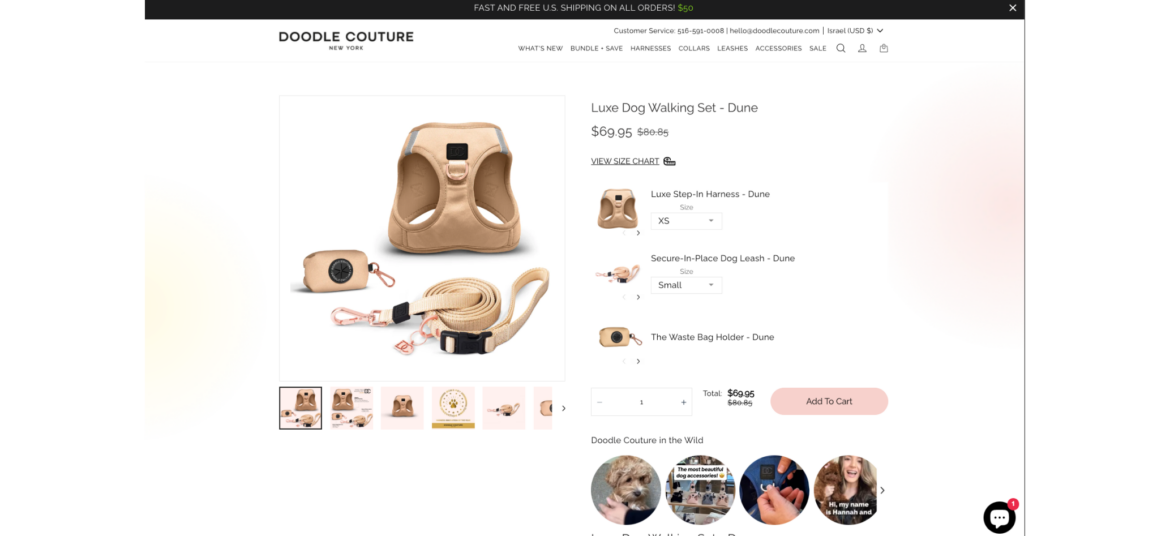
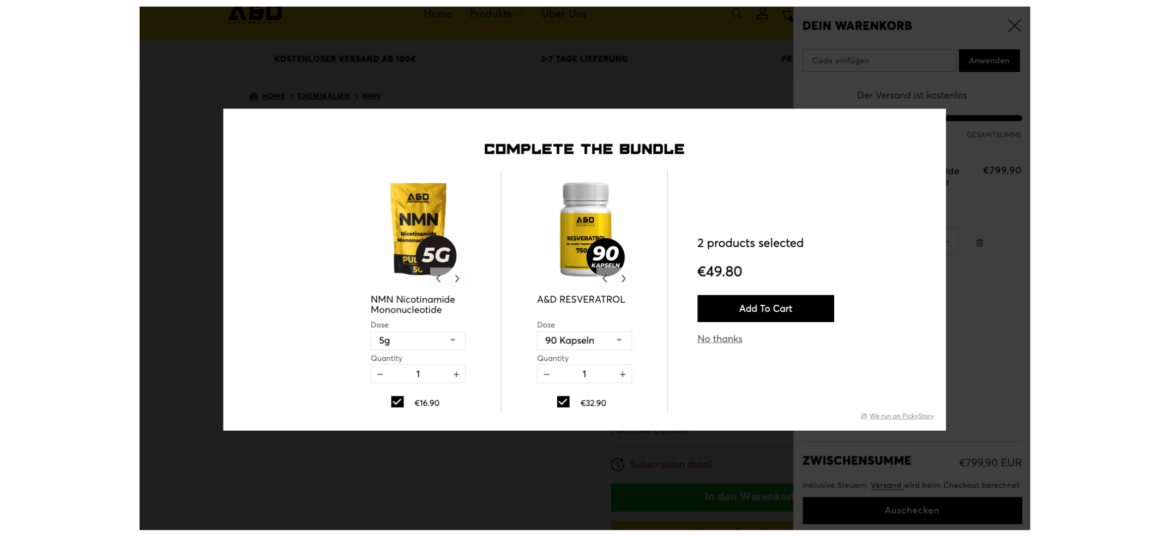
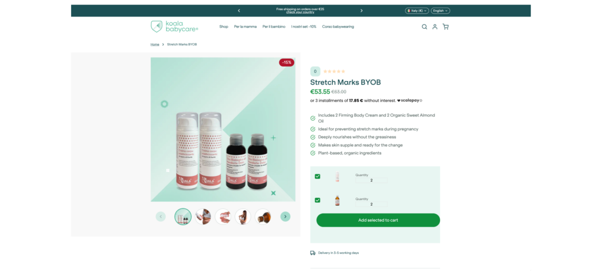
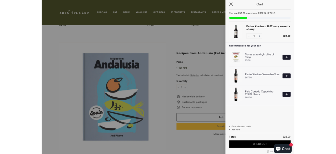
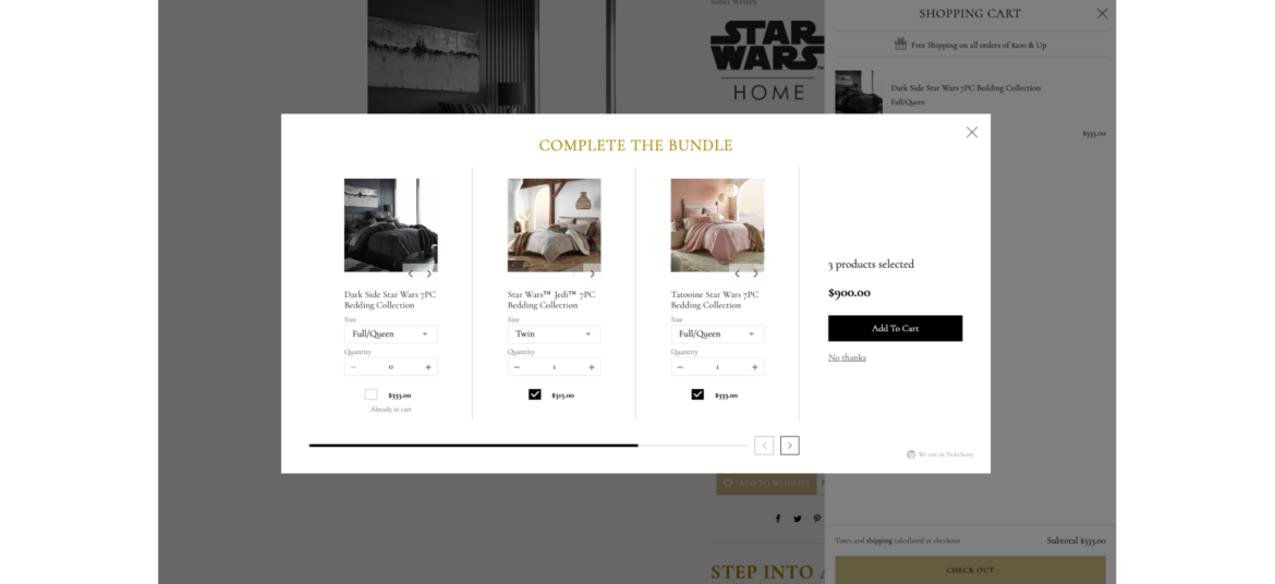
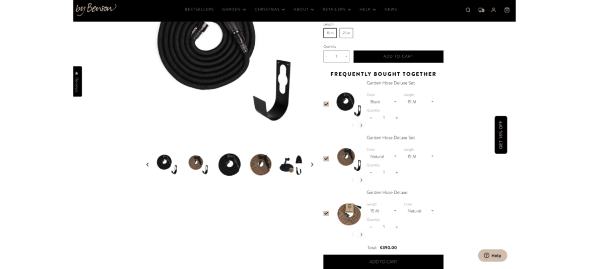
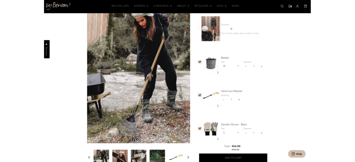
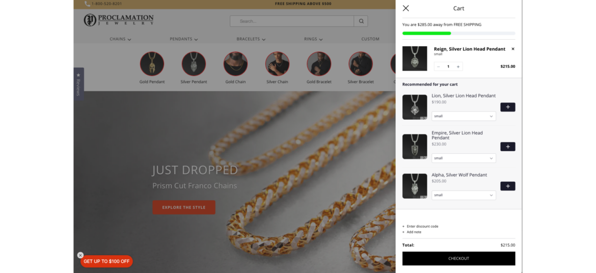
Whitespace: No one likes real-life clutter, so it’s natural that digital clutter is treated with the same disdain. Whitespace refers to the instances of blankness that lie in between elements, ones that give the reader a break from the noise and highlight the elements that need highlighting.
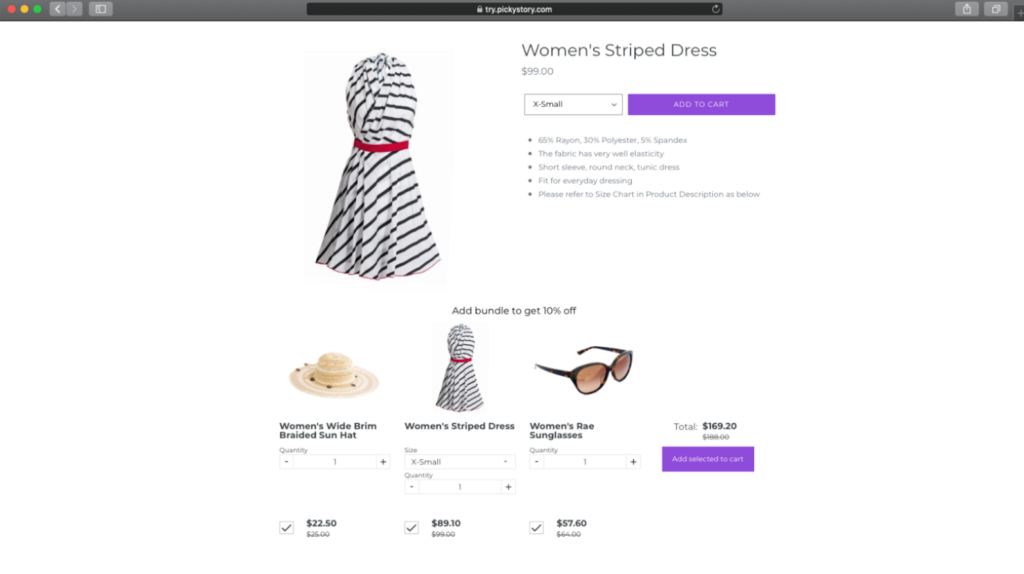
It’s an incredibly powerful tool when you’re looking to optimize a Shopify product page, as it can increase visitor comprehension of your product by 20%.
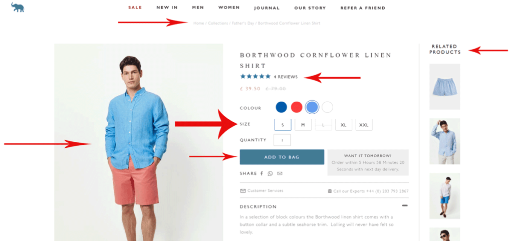
Font: Something that really connects with a customer is font. It helps to convey the aesthetic and maybe even the lifestyle of your product, which can be surprisingly effective at driving conversions.
There’s an unbelievable amount of choice in the world of fonts. Shopify is fairly limited in its offerings, but you can easily find one that fits your store via DaFont or 1001 Free Fonts.
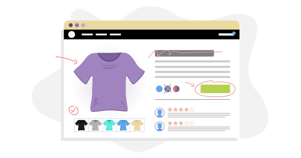
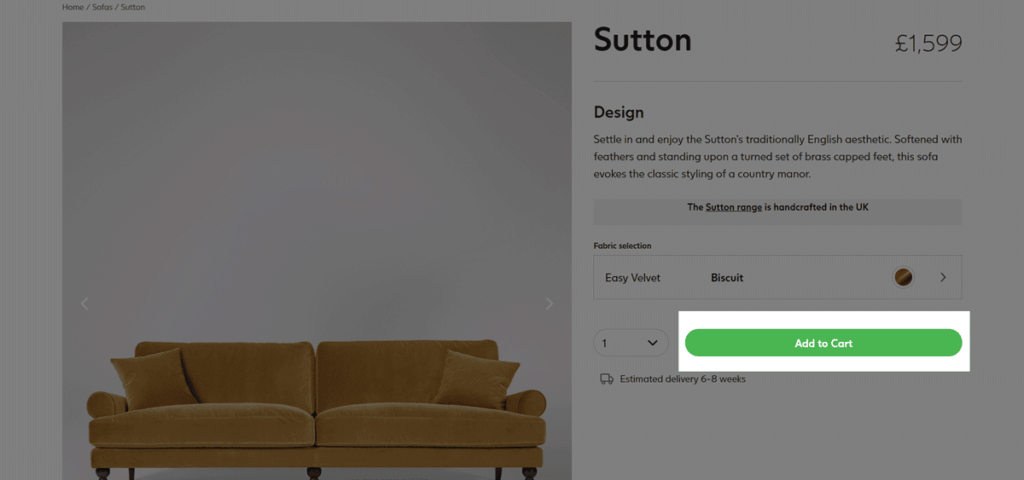
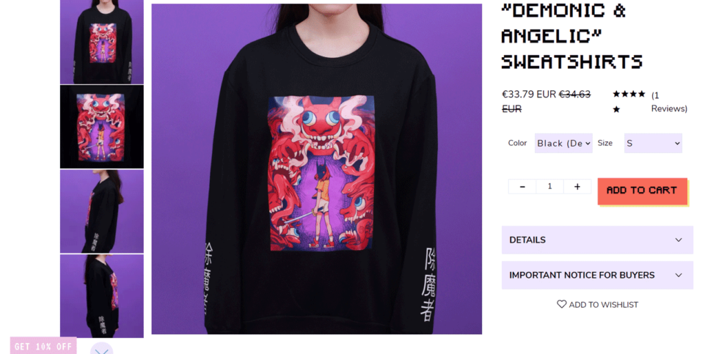
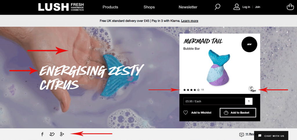
Color: The colors you choose for your page are probably more influential on your customers than you think. We’re hardwired as humans to associate colors in different ways: red for urgency, blue for calm, pink for femininity, purple for elegance, etc.
Finding a color that bridges the gap between your audience’s needs and your product’s offerings can work subconscious wonders on your visitors and end up increasing your conversion rate.