10 CTA Examples to Drive Conversions from Your Product Deals
5 minutes
CTA examples: After all of your marketing efforts to increase sales, you still need to work to apply them all through the customer life cycle.
Bringing customers to your store isn’t enough – you need to convince them that your products are worth purchasing. One of the most effective ways to do this is to use strong call to action (CTA) examples across your website.
There are many different CTA examples that can have a significant impact on your conversions. In this article, we’re going to take a look at what makes a good CTA, and provide CTA examples that you can use to drive conversions in your store.
What is a CTA?
A call to action is pretty much what the term sounds like: you’re asking shoppers to do what you desire. CTA examples include clicking a “buy now” button on a product page or signing up to an email list to “get a discount.”
Why is a strong CTA important for your product deals?
Not adding CTAs (or adding generic, weak CTAs) is a huge mistake that will hurt your business. There are reasons why strong CTA buttons are so popular on e-commerce sites – three main reasons, actually.
CTAs motivate your sales funnel
CTAs and sales funnels go hand in hand. The calls to action serve as transitions between the phases of the buyer’s journey. They instruct your customers on what to do next, prompting them to take immediate action.
CTAs tell shoppers what to do next and encourage them to act immediately. Without them, your potential customers may not know where to go next. And as a result, they are more likely to exit the product page or abandon their cart.
CTAs are a great way to keep your audience engaged with your brand or product. Whether you want customers to visit your store or add a product to their cart, you must induce this action with a well-placed (and well-worded) CTA.
Shoppers want CTAs
Shoppers want and expect a CTA; they are not just important for sales. Many customers rely on the CTA to prompt them to take the next action. They have looked at your product, are interested in buying, and want a CTA button to proceed.
So omitting a CTA might mislead shoppers and jeopardize conversions. With CTA buttons, customers can easily take your desired action. That benefits them and your online store.
10 CTA examples to increase your conversions
#1 "Buy Now" CTA (most common CTA example)
“Buy Now” is one of the most popular CTAs. Indeed, it appears simple and obvious, but it helps boost sales conversion rates. You can place this button alongside special offers. In many cases, a “buy now” button is added above or below the “add to cart” button.
This usually takes customers directly to the checkout/payment page and is a great option for customers looking to make a speedy purchase.
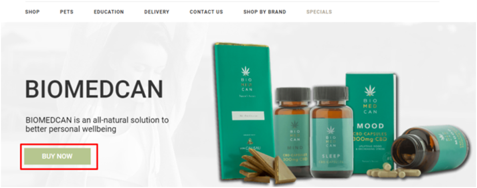
Source: biomedcan.co.za
Biomedcan is advertising its product as an all-natural solution to better personal well-being in this picture. And underneath that statement, they added a simple, yet strong CTA button, “Buy Now.”
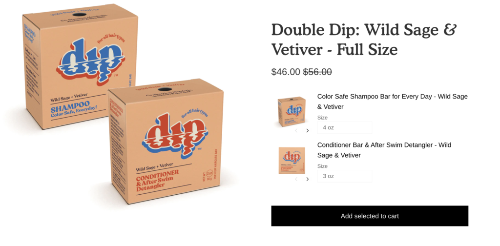
#2 "Add to Cart" CTA
The “add to cart” button is another incredibly important CTA. If you want to encourage your shoppers to keep browsing your products, an add to cart button is the CTA you want on your product pages, as it will simply add a product to the cart and allow the customer to keep shopping in the meantime.
Source: dipalready.com
Of course, you can play with the wording. If you are selling a package of products, you could use “add package to cart” or “add all to cart” to improve clarity for customers. If your brand tends to use more fun or playful language you could also create an add to cart CTA with a bit more sass.
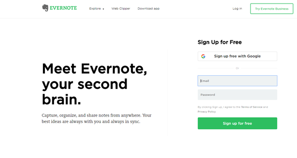
#3 "Sign up For Free" CTA
Not all CTAs need to be centered around encouraging your customers to make a purchase. By pushing customers to sign up for emails, you are increasing your reader base and extending your audience.
People love free stuff. As a result, businesses often use the word “free” in their marketing campaign – and it works. If you can offer free services or products, using this CTA will push potential customers to take action. If they eventually find the product or service useful, they may decide to upgrade or buy a full package.
Source: evernote.com
Evernote has applied this strong CTA quite well. They have a green “Sign up For Free” button on their homepage. That means every potential customer will get to see it and get the free offer.
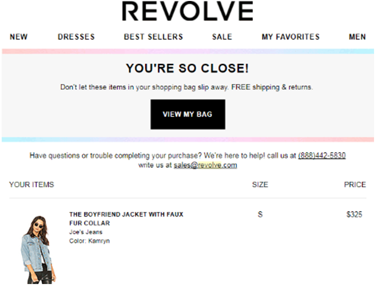
#4 "View My Bag" CTA (must-have CTA example)
Many shoppers add their favorite items to their carts but sometimes fail to complete the checkout process. It only takes a simple push. You can do this by placing an irresistible e-commerce CTA!
The best way to do this is by offering a special discount or free delivery on the products they have in their shopping carts.
Source: revolve.com
Instead of using “Shop Now,” use this instead:
Title: “You’re so close. Don’t let these items in your cart slip away.
“CTA Button: “View My Bag”
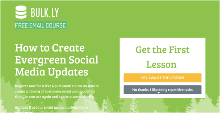
#5 "Yes/NO" CTA
This CTA example can help make the “No” option strengthen your call to action. In the example below, Bulkly’s “No” option is “I like doing repetitive tasks.” Since most people would disagree, more people will select “Yes.”
Source: bulk.ly
#6 "Get started with a quiz" CTA
Quizzes are popular because people love them. Adding a quiz to your brand and homepage can help improve conversion rates. Surveymonkey, Typeform, and Quiz Maker are some of the best platforms for developing website quizzes.
Your CTA can be like this:
Source: scentbird.com
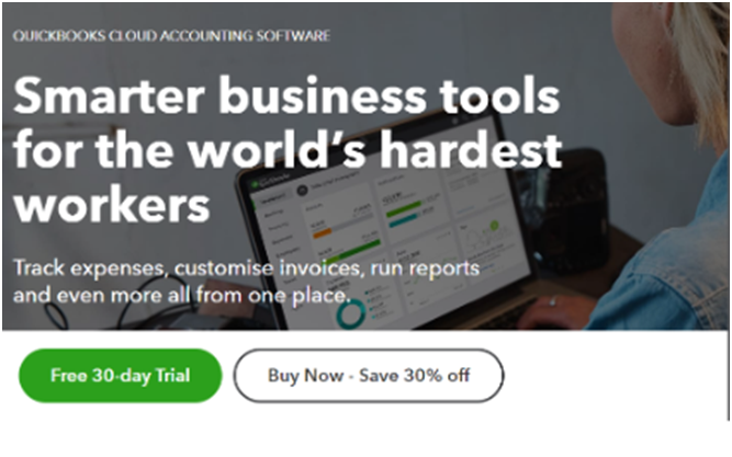
#7 "Free Trial" CTA
This strong CTA offers free and paid options to customers. Since they know visitors want a smarter business tool, they make the process easy. You can either try it for free or buy the premium version at a huge discount.
Source: quickbooks.intuit.com
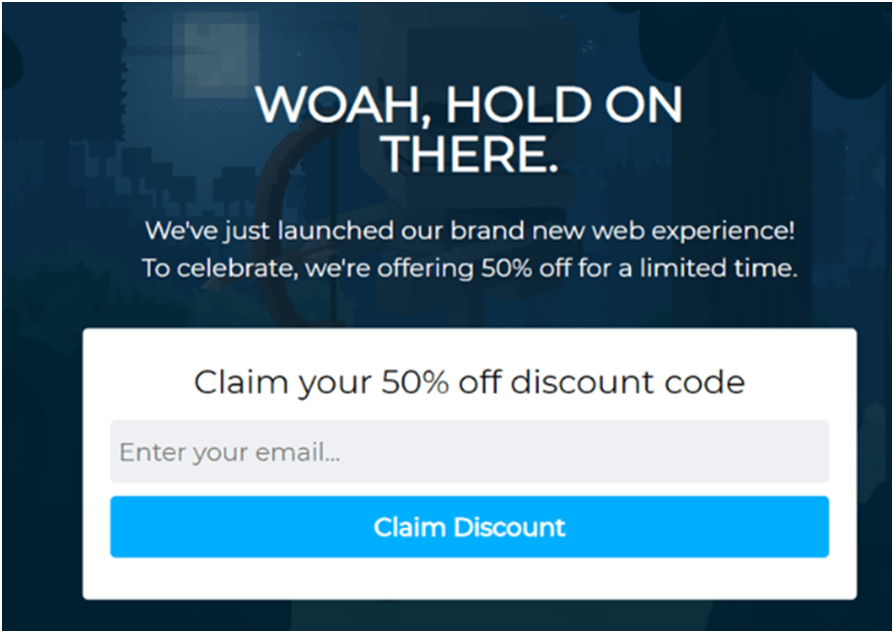
#8 "Claim Discount" CTA
The CTA is clear: “claim discount,” making it a strong CTA example. In fact, you can use CTAs just like this to increase your sales conversion rate.
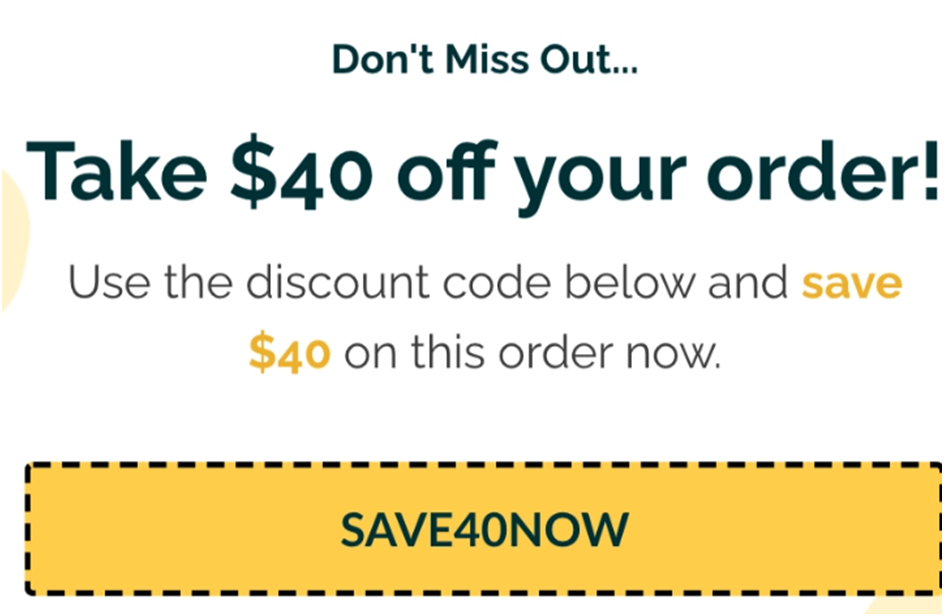
#9 "Discount code" CTA
In the image below, the CTA button was changed to include the offer in the button, SAVE40NOW. This works because many visitors won’t have the patience to read your campaign. Instead, they’ll go to areas that pique their interest the most. When they notice the reward on the button, they’ll be tempted to click it and activate their discount code.
#10 "A wish list" CTA
A wishlist CTA lets visitors keep a list of things to buy later. This helps shoppers simplify the purchase process, compare prices, and ultimately increase conversion rates.
What makes these CTA examples so effective?
Short and clear
A strong CTA is short, concise and clear. So avoid using sentences; use short phrases instead. You only need 2 to 5 words to convey a message effectively. You can use up to 5-7 words in some situations. But make sure these longer CTAs (e.g. “Buy Now and Save 50%.”) add value.
A sense of urgency
CTAs that include a sense of urgency encourages viewers to act instantly without letting a distraction sway them from your offer. For example, “Limited time offer” portrays a sense of urgency to act or respond immediately.
Action words
The most effective CTAs include action words that tell customers what to do next. So use powerful words to evoke an emotional response and persuade people to take action.
Attention-grabbing design
A strong CTA example has an eye-catching design that grabs buyers’ attention. Use a distinct color for CTA text or a brightly colored button to capture attention. This strategy makes it easier for buyers or visitors to find the CTA.
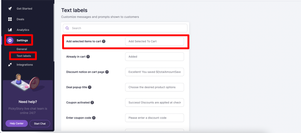
How to change the “Add to Cart” text in PickyStory
By default, your PickyStory product deals will have the CTA “Add to cart” or “Add selected to cart,” depending on the type of deal you are offering. However, you can easily customize this to create any CTA you wish to use. Here’s how:
Navigate to Settings >> Text Labels and alter the text in the “Add selected items to cart” field:
Source: app.pickystory.com
Use these CTA examples to captivate your customers
CTAs are important tools for pushing customers through your conversion funnel, and also can be a great way to simplify and add clarity to the customer journey. Make sure you create relevant and useful CTAs that your customers can clearly understand.
Finally, never add a CTA without testing it. Do an A/B test on every strong CTA repeatedly. You’ll be amazed by how a few tweaks can greatly improve conversion rates.
If you’re looking for more e-commerce tips and recommendations, check out the PickyStory blog.
Present bundles of products that are frequently purchased together, simplifying the decision-making process for your customers
What is Frequently Bought Together?
It is a recommendation scenario that suggests additional products to the shopper, which are often purchased by other customers in conjunction with the item they are currently viewing or considering purchasing.
Why are brands using it?
Boosted sales and revenue - increases average order value by suggesting complementary products, leading to higher sales
Simplified customer experience - saves time and effort for customers by offering relevant product recommendations, enhancing satisfaction and loyalty
Cross-selling opportunities: "Frequently Bought Together" creates opportunities for cross-selling, allowing brands to introduce shoppers to a wider range of products
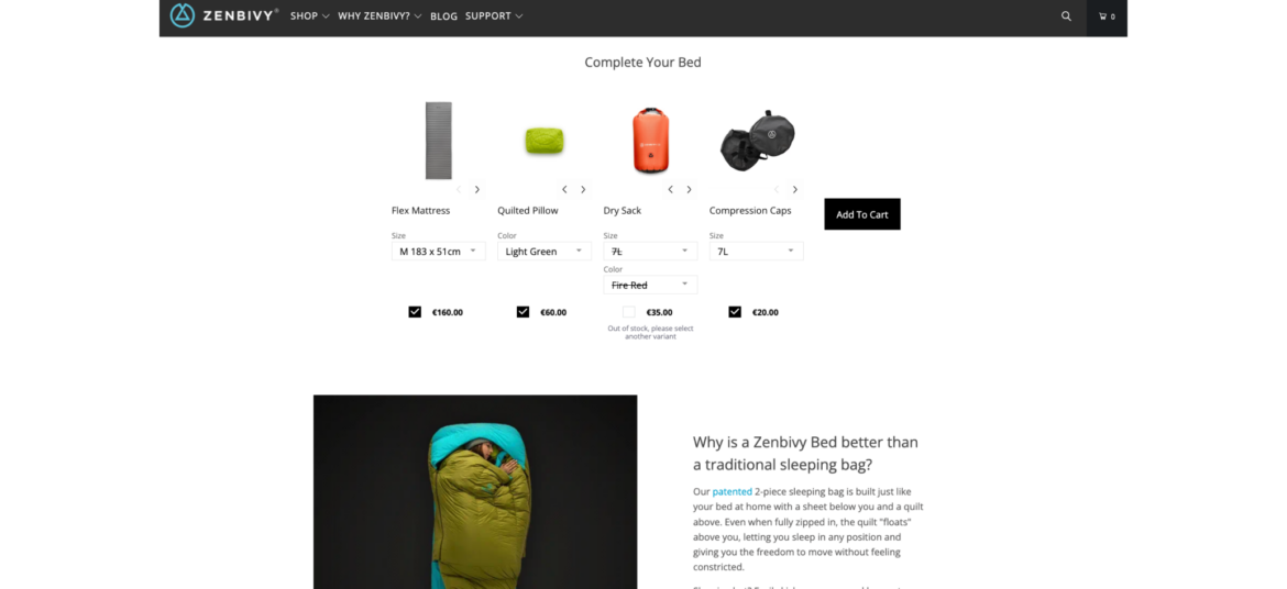
How Zenbivy uses Frequently Bought Together
Zenbivy simplifies the shopping experience by displaying all the needed pieces of its sleeping systems on one page, under each product that is part of a sleeping system. This way, shoppers don't need to go through multiple pages and guess what goes with what. Zenbivy enjoys much larger orders, and shoppers can have a seamless experience.
Offer shoppers the ability to create their own bundle of products by selecting from a range of available options
What is Build Your Own Bundle?
Build Your Own Bundle scenario provides shoppers with the flexibility to select specific items or features that best meet their individual needs and preferences. The selection is based on a pre-curated set of products by the merchant.
Why are brands using it?
Increase AOV - encourage higher spending with customizable bundles, raising average order values and revenue
Personalize purchases - tailor products to customer preferences, potentially increasing Average Order Value (AOV) and overall revenue
Stand out competitively - offer a unique option, attracting customers looking for customized solutions
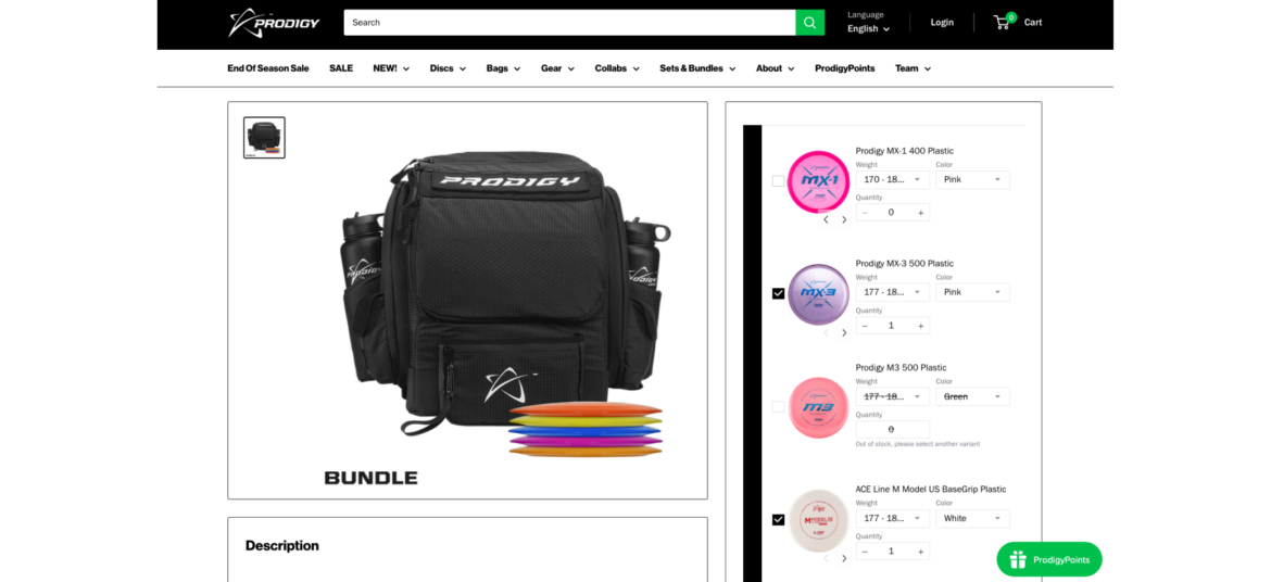
How Prodigy uses Build Your Own Bundle
Prodigy enables its shoppers to build their own bundle of golf discs, fully personalizing the shopping experience. Shoppers get an easy way to select their favorite discs while Prodigy consistently increases its AOV.
Combine multiple individual products into a bundle and sell them as a single unit
What is Bundle as Product?
Bundle as Product scenario involves bundling multiple individual products together and selling them as a single unit. This strategy offers shoppers a curated selection of items that work together or complement each other.
Why are brands using it?
Increase sales and revenue. Bundling leads to higher sales volumes and greater revenue due to the perceived cost-effectiveness.
Highlight the value and convenience of purchasing a set of items together, enticing them with an irresistible offer
Enhance value perception. Bundles create the perception of added value, making them more appealing to customers.
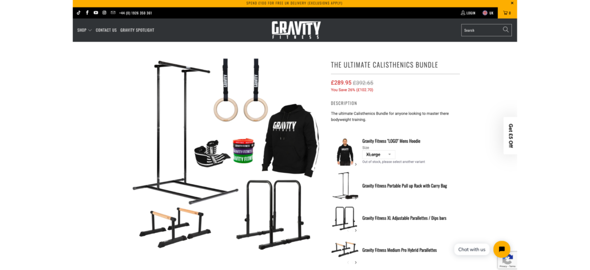
How Gravity Fitness uses Bundle as Product
Gravity Fitness knows that it's not an easy task for shoppers to collect all the required pieces for a complete home gym. That's why they have created pre-made home gym bundles for an easy shopping experience. Now they have fewer SKU issues, a higher AOV, and happier customers.
Encourage shoppers to add the missing items to complete the bundle when they add items to cart
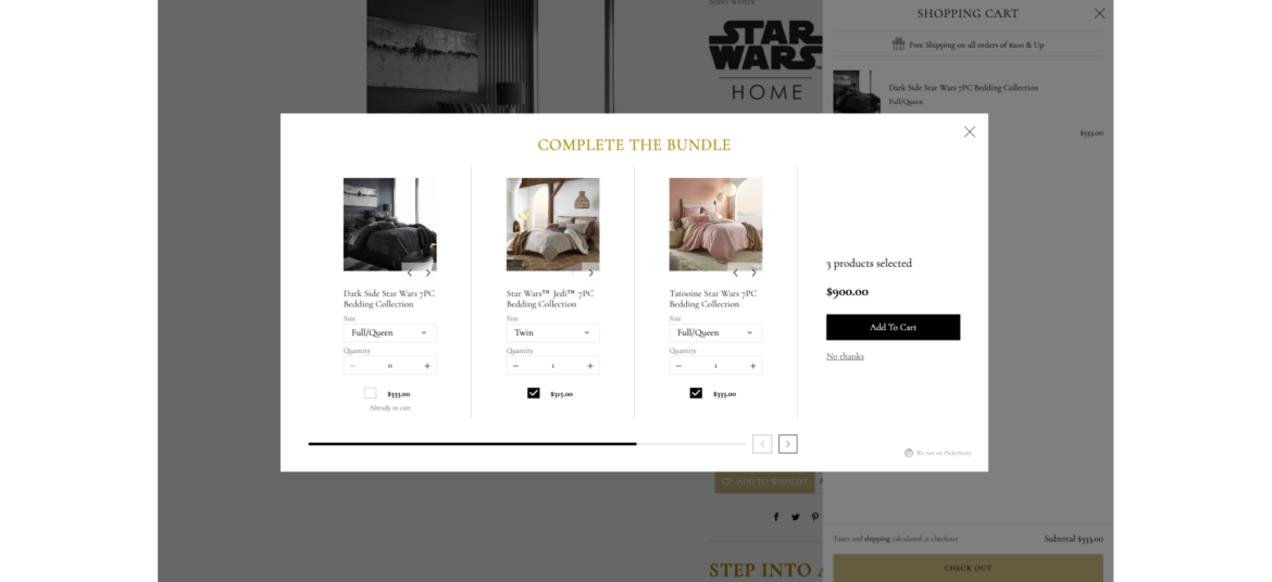
What is Complete the Bundle?
Complete the Bundle popup is a deal that appears when a shopper has added some items to their shopping cart but has not yet added all the recommended or related products that typically go together.
Why are brands using it?
Increase Average Order Value (AOV) - encourage shoppers to add complementary products, leading to higher total purchases
Highlight the value and convenience of purchasing a set of items together, enticing them with an irresistible offer
Enhance value perception. Bundles create the perception of added value, making them more appealing to customers.
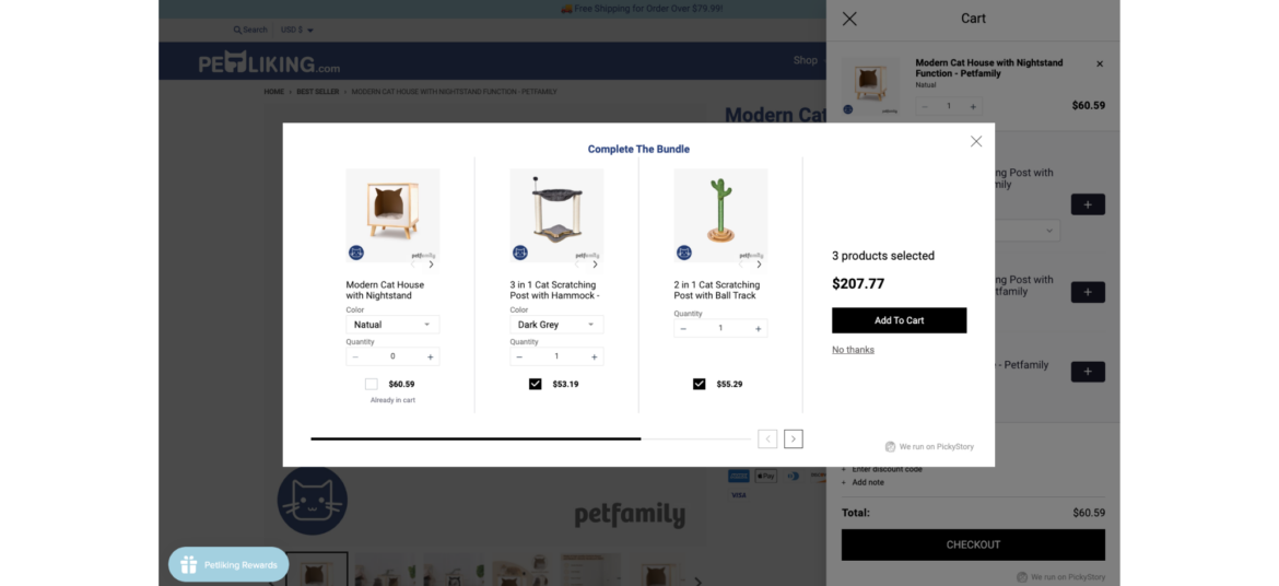
How Petliking.com uses Complete the Bundle
Petliking.com never misses an opportunity to offer more products to its shoppers after they add an item to cart. By offering to complete the bundle, Petliking.com helps shoppers to discover additional related items that complement each other while increasing its order size.
Combine multiple individual products into a bundle and sell them as a single unit
What is Bundle as Product?
Bundle as Product scenario involves bundling multiple individual products together and selling them as a single unit. This strategy offers shoppers a curated selection of items that work together or complement each other.
Why are brands using it?
Increase sales and revenue. Bundling leads to higher sales volumes and greater revenue due to the perceived cost-effectiveness.
Highlight the value and convenience of purchasing a set of items together, enticing them with an irresistible offer
Enhance value perception. Bundles create the perception of added value, making them more appealing to customers.
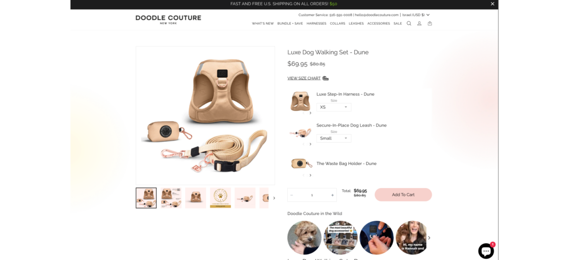
How Doodle Couture uses Bundle as Product
Doodle Couture makes it so easy for shoppers to equip their best friend with the required outfit. Instead of moving back and forth between pages, Doodle Couture offer a complete bundle for pets on one page with a single click. This boosts AOV while making the shopper happy.
Encourage shoppers to add the missing items to complete the bundle when they add items to cart
What is Complete the Bundle?
Complete the Bundle popup is a deal that appears when a shopper has added some items to their shopping cart but has not yet added all the recommended or related products that typically go together.
Why are brands using it?
Increase Average Order Value (AOV) - encourage shoppers to add complementary products, leading to higher total purchases
Highlight the value and convenience of purchasing a set of items together, enticing them with an irresistible offer
Enhance value perception. Bundles create the perception of added value, making them more appealing to customers.
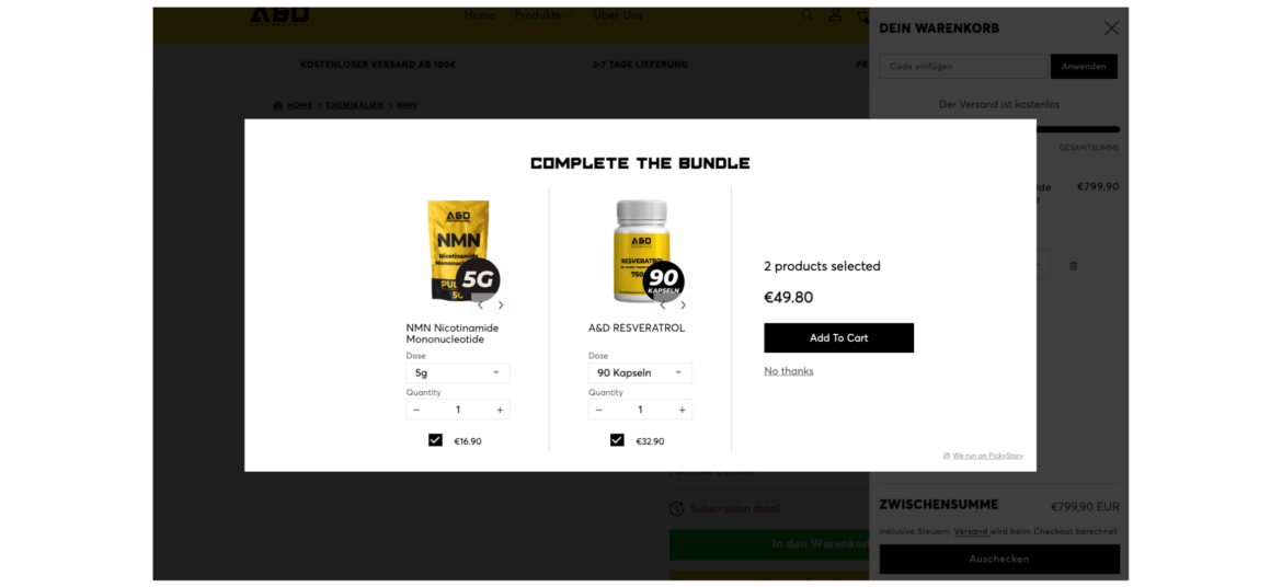
How A&D Performance uses Complete the Bundle
A&D Performance always seizes intent-based opportunities to offer additional supplements when shoppers add items to their cart. By displaying a 'Complete the Bundle' popup, A&D Performance increases their Average Order Value (AOV) while helping their customers discover more products.
Combine multiple individual products into a bundle and sell them as a single unit
What is Bundle as Product?
Bundle as Product scenario involves bundling multiple individual products together and selling them as a single unit. This strategy offers shoppers a curated selection of items that work together or complement each other.
Why are brands using it?
Increase sales and revenue. Bundling leads to higher sales volumes and greater revenue due to the perceived cost-effectiveness.
Highlight the value and convenience of purchasing a set of items together, enticing them with an irresistible offer
Enhance value perception. Bundles create the perception of added value, making them more appealing to customers.
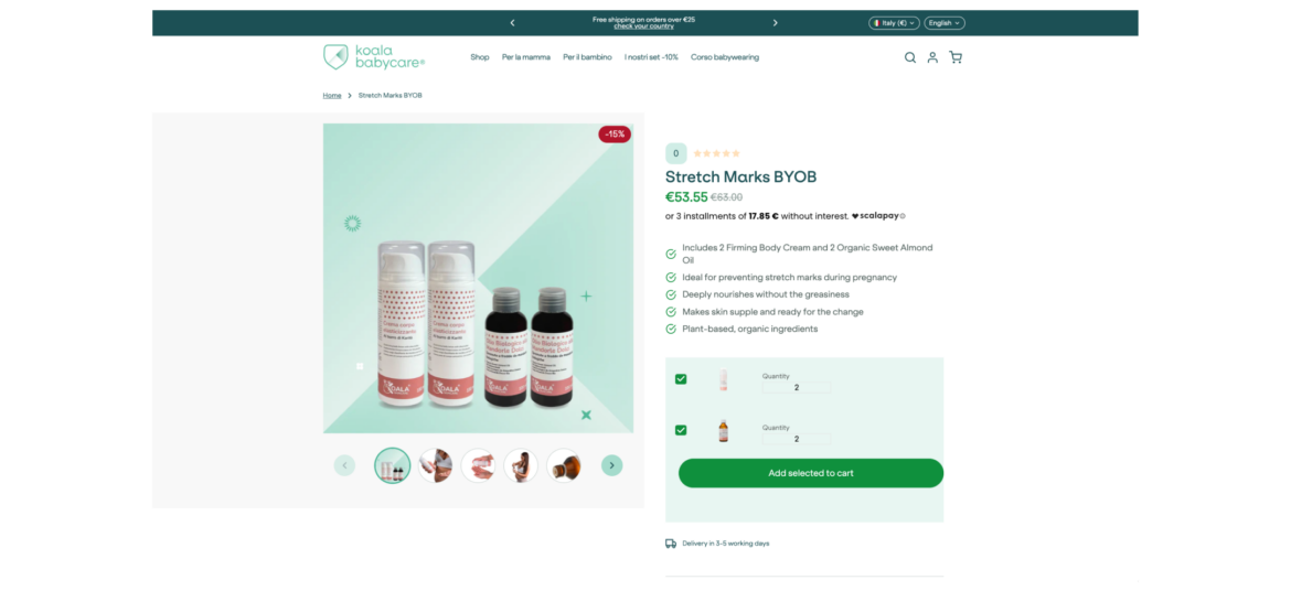
How Koala Babycare uses Bundle as Product
Koala Babycare simplifies its shoppers lives by offering complete cream & oil sets. Shoppers can easily pick their favorite bundles and save while Koala Babycare increases its AOV and number of orders.
Encourage shoppers to spend a certain amount of money (X) in order to receive a specific benefit or reward (Y)
What is Spend X Get Y?
"Spend X, Get Y" promotions are designed to motivate shoppers to spend more money with the promise of receiving something valuable in return. It's a win-win situation where customers get a benefit, and the store increases its sales.
Why are brands using it?
Promotes larger purchases - motivates shoppers to spend more to qualify for the promotion, potentially leading to bigger transactions
Increases Average Order Value (AOV) - encourages higher spending, leading to a higher average transaction value
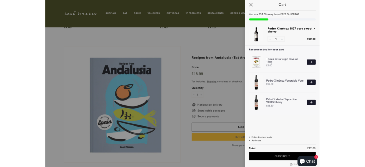
Jose Pizarro takes advantage of PickyCart and 'Spend X Get Y' to reward shoppers with free shipping when they spend £75 in-store. This is a win-win offer for both sides - while Jose Pizarro increases the AOV, shoppers receive a sweet reward.
Encourage shoppers to add the missing items to complete the bundle when they add items to cart
What is Complete the Bundle?
Complete the Bundle popup is a deal that appears when a shopper has added some items to their shopping cart but has not yet added all the recommended or related products that typically go together.
Why are brands using it?
Increase Average Order Value (AOV) - encourage shoppers to add complementary products, leading to higher total purchases
Highlight the value and convenience of purchasing a set of items together, enticing them with an irresistible offer
Enhance value perception. Bundles create the perception of added value, making them more appealing to customers.
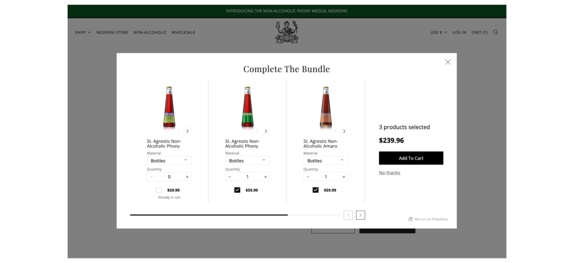
How Agrestis uses Complete the Bundle
Agrestis makes sure to consistently display a variety of spirits to their shoppers at the right moment. As shoppers add spirits to the cart, Agrestis extends an offer to include more related spirits, resulting in an improved shopping experience and a higher Average Order Value (AOV).
Offer shoppers the ability to create their own bundle of products by selecting from a range of available options
What is Build Your Own Bundle?
Build Your Own Bundle scenario provides shoppers with the flexibility to select specific items or features that best meet their individual needs and preferences. The selection is based on a pre-curated set of products by the merchant.
Why are brands using it?
Increase AOV - encourage higher spending with customizable bundles, raising average order values and revenue
Personalize purchases - tailor products to customer preferences, potentially increasing Average Order Value (AOV) and overall revenue
Stand out competitively - offer a unique option, attracting customers looking for customized solutions
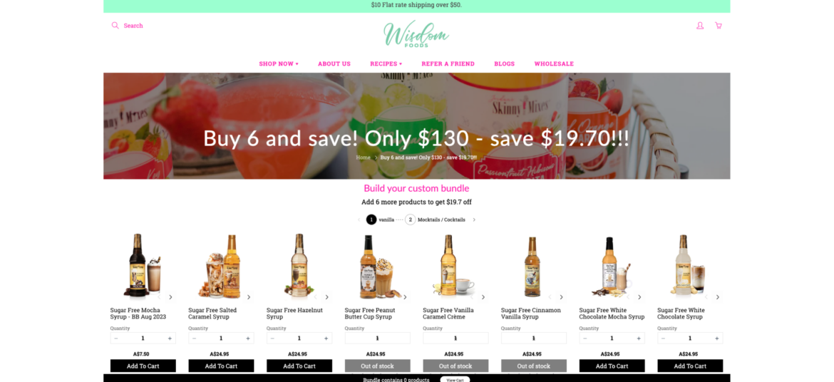
How Wisdom Foods uses Build Your Own Bundle
Wisdom Foods wanted to upgrade its shopping experience by making it easy for shoppers to pick their desired syrups. Now it allows shoppers to build their own bundles of syrups from a single page and checking out. This increases Wisdom Foods' order sizes while providing a personalized experience to their shoppers.
Combine multiple individual products into a bundle and sell them as a single unit
What is Bundle as Product?
Bundle as Product scenario involves bundling multiple individual products together and selling them as a single unit. This strategy offers shoppers a curated selection of items that work together or complement each other.
Why are brands using it?
Increase sales and revenue. Bundling leads to higher sales volumes and greater revenue due to the perceived cost-effectiveness.
Highlight the value and convenience of purchasing a set of items together, enticing them with an irresistible offer
Enhance value perception. Bundles create the perception of added value, making them more appealing to customers.
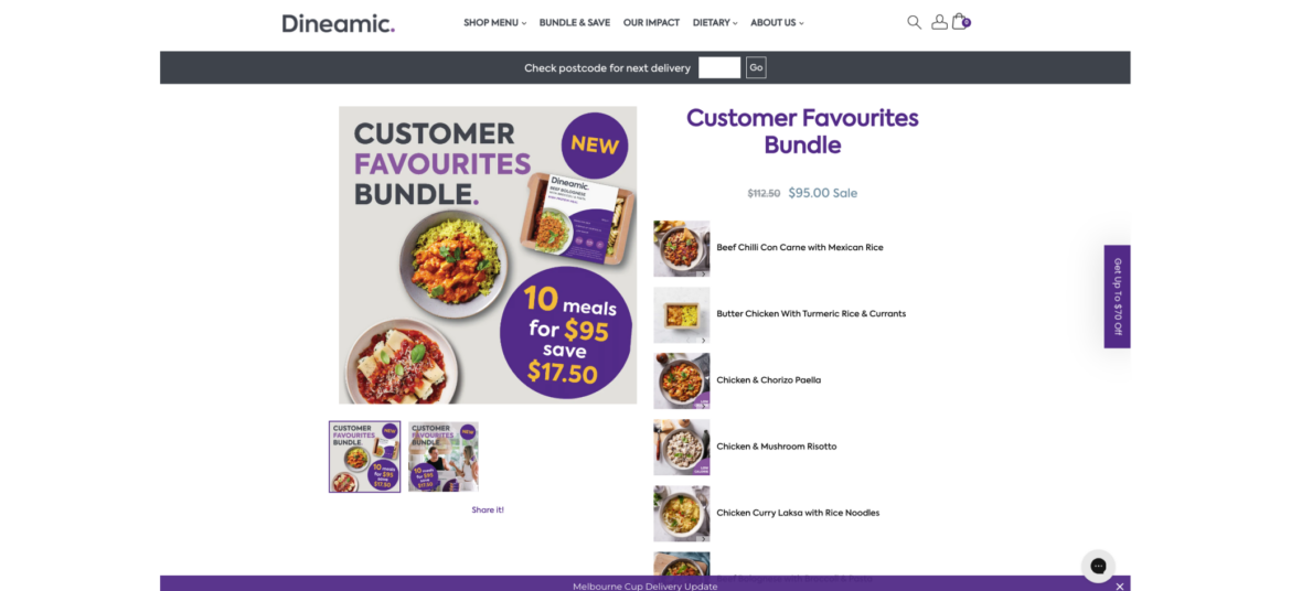
How Dineamic uses Bundle as Product
Dineamic takes advantage of bundles to package their pre-made meals by dietary requirements, so every shopper can quickly and easily find the desired category of meals and add them all with a single click. This simplifies the shopping experience and benefits both sides, as Dineamic boosts its Average Order Value (AOV).
Combine multiple individual products into a bundle and sell them as a single unit
What is Bundle as Product?
Bundle as Product scenario involves bundling multiple individual products together and selling them as a single unit. This strategy offers shoppers a curated selection of items that work together or complement each other.
Why are brands using it?
Increase sales and revenue. Bundling leads to higher sales volumes and greater revenue due to the perceived cost-effectiveness.
Highlight the value and convenience of purchasing a set of items together, enticing them with an irresistible offer
Enhance value perception. Bundles create the perception of added value, making them more appealing to customers.
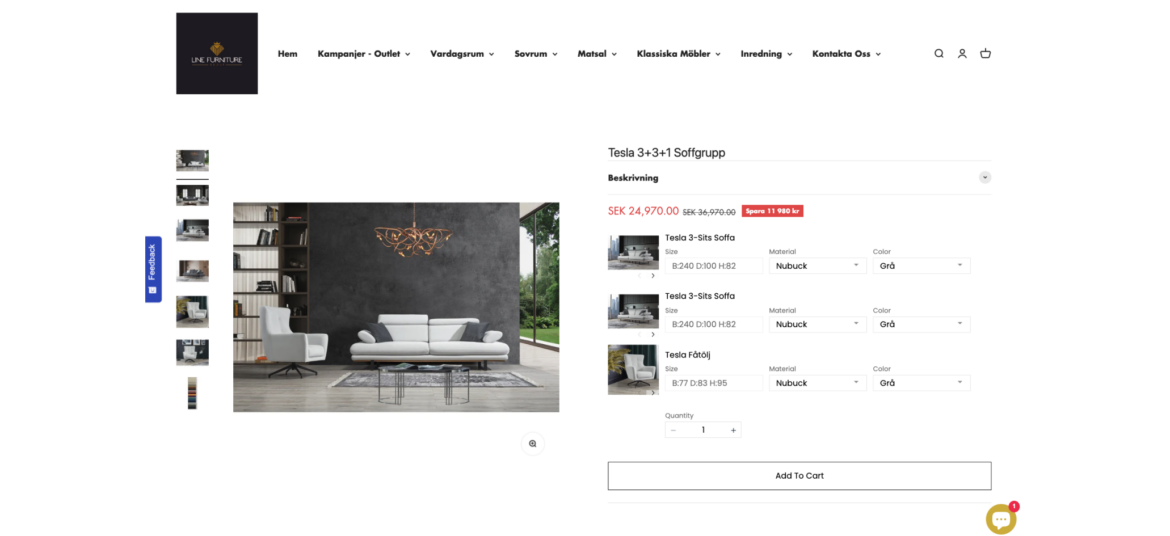
How Line Furniture uses Bundle as Product
Line furniture simplifies its shoppers lives by offering complete furniture sets in different styles. Now shoppers can easily find their favorite living room and save while Line Furniture increases its AOV and number of orders.
Encourage shoppers to add the missing items to complete the bundle when they add items to cart
What is Complete the Bundle?
Complete the Bundle popup is a deal that appears when a shopper has added some items to their shopping cart but has not yet added all the recommended or related products that typically go together.
Why are brands using it?
Increase Average Order Value (AOV) - encourage shoppers to add complementary products, leading to higher total purchases
Highlight the value and convenience of purchasing a set of items together, enticing them with an irresistible offer
Enhance value perception. Bundles create the perception of added value, making them more appealing to customers.
How Sobel Home uses Complete the Bundle
Sobel Home never misses an opportunity to offer more products to its shoppers after they add an item to cart. By offering to complete the bundle, Sobel Home helps shoppers to discover additional related items that complement each other while increasing its order size.
Present bundles of products that are frequently purchased together, simplifying the decision-making process for your customers
What is Frequently Bought Together?
It is a recommendation scenario that suggests additional products to the shopper, which are often purchased by other customers in conjunction with the item they are currently viewing or considering purchasing.
Why are brands using it?
Boosted sales and revenue - increases average order value by suggesting complementary products, leading to higher sales
Simplified customer experience - saves time and effort for customers by offering relevant product recommendations, enhancing satisfaction and loyalty
Cross-selling opportunities: "Frequently Bought Together" creates opportunities for cross-selling, allowing brands to introduce shoppers to a wider range of products
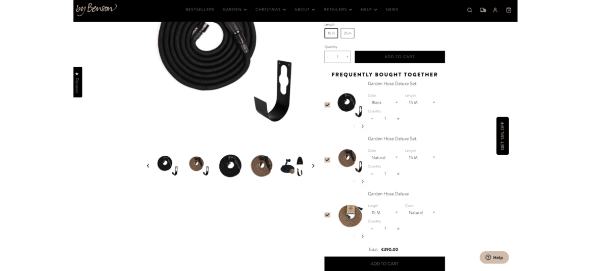
How By Benson uses Frequently Bought Together
By Benson never misses an opportunity to offer more options to its customers. While shoppers visit their product pages, they constantly offer to extend or upgrade the targeted product, resulting in better service and larger orders.
Offer shoppers the ability to create their own bundle of products by selecting from a range of available options
What is Build Your Own Bundle?
Build Your Own Bundle scenario provides shoppers with the flexibility to select specific items or features that best meet their individual needs and preferences. The selection is based on a pre-curated set of products by the merchant.
Why are brands using it?
Increase AOV - encourage higher spending with customizable bundles, raising average order values and revenue
Personalize purchases - tailor products to customer preferences, potentially increasing Average Order Value (AOV) and overall revenue
Stand out competitively - offer a unique option, attracting customers looking for customized solutions
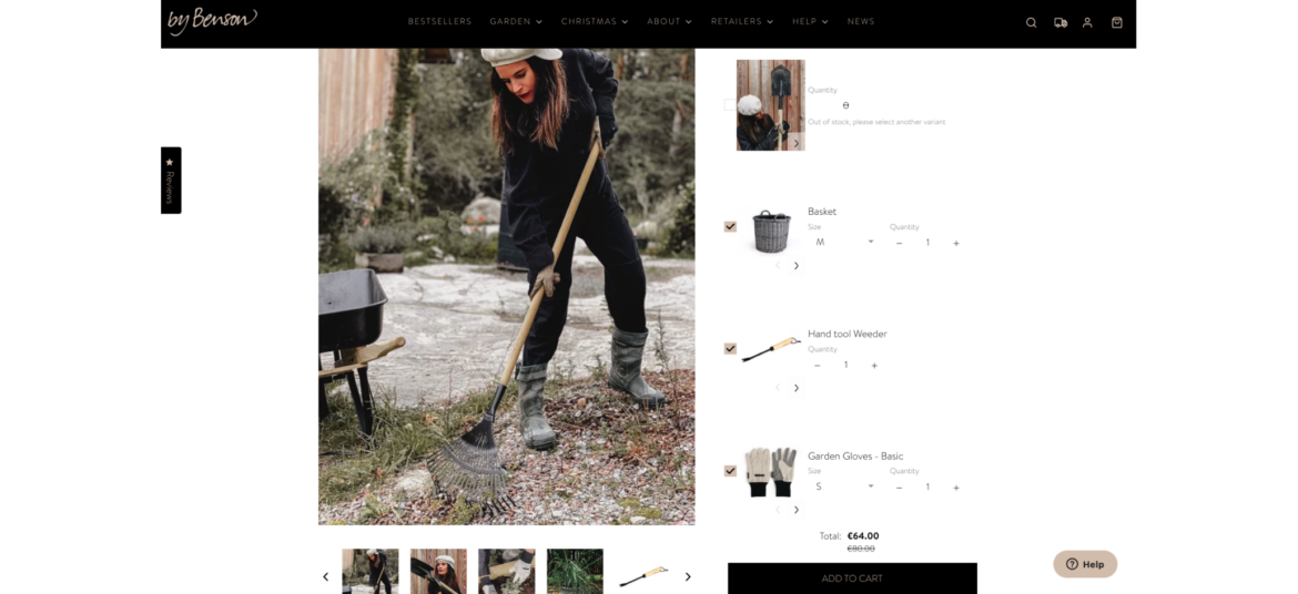
How By Benson uses Build Your Own Bundle
As a professional destination for home gardeners, By Benson understands that it might be tricky to select all the necessary tools to make your garden shine. That's why By Benson helps its shoppers choose bundles of tools with a single click, while boosting their Average Order Value (AOV).
Offer shoppers the ability to create their own bundle of products by selecting from a range of available options
What is Build Your Own Bundle?
Build Your Own Bundle scenario provides shoppers with the flexibility to select specific items or features that best meet their individual needs and preferences. The selection is based on a pre-curated set of products by the merchant.
Why are brands using it?
Increase AOV - encourage higher spending with customizable bundles, raising average order values and revenue
Personalize purchases - tailor products to customer preferences, potentially increasing Average Order Value (AOV) and overall revenue
Stand out competitively - offer a unique option, attracting customers looking for customized solutions
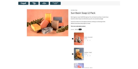
How Good Store uses Build Your Own Bundle
Good Store encourages its shoppers to build their own custom bundles of soaps. They provide a variety of soaps to choose from and leave the selection itself to the shopper. This is fun, rewarding, and makes both sides happy.
Combine multiple individual products into a bundle and sell them as a single unit
What is Bundle as Product?
Bundle as Product scenario involves bundling multiple individual products together and selling them as a single unit. This strategy offers shoppers a curated selection of items that work together or complement each other.
Why are brands using it?
Increase sales and revenue. Bundling leads to higher sales volumes and greater revenue due to the perceived cost-effectiveness.
Highlight the value and convenience of purchasing a set of items together, enticing them with an irresistible offer
Enhance value perception. Bundles create the perception of added value, making them more appealing to customers.
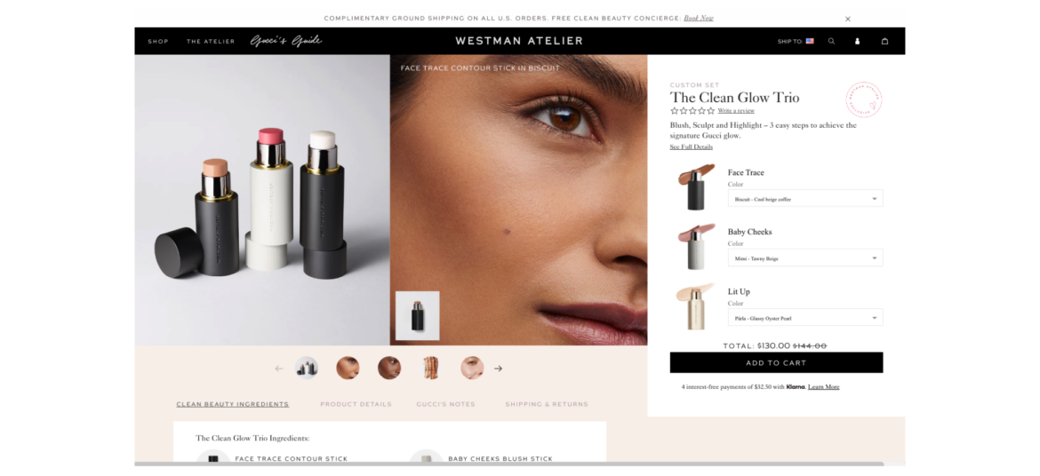
How Westman Atelier uses Bundle as Product
Westman Atelier understands that the attention span of the average shopper is quite short. Furthermore, with numerous options available, it's often easier to opt for a suggested bundle that's already curated for you.
Present bundles of products that are frequently purchased together, simplifying the decision-making process for your customers
What is Frequently Bought Together?
It is a recommendation scenario that suggests additional products to the shopper, which are often purchased by other customers in conjunction with the item they are currently viewing or considering purchasing.
Why are brands using it?
Boosted sales and revenue - increases average order value by suggesting complementary products, leading to higher sales
Simplified customer experience - saves time and effort for customers by offering relevant product recommendations, enhancing satisfaction and loyalty
Cross-selling opportunities: "Frequently Bought Together" creates opportunities for cross-selling, allowing brands to introduce shoppers to a wider range of products
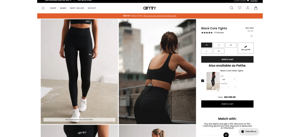
How Aim’n uses Frequently Bought Together
Aim'n never misses a shopper when it comes to its product pages. It utilizes the 'Frequently Bought Together' feature to suggest additional sizes to product viewers, ensuring that no shopper is left without a solution while keeping its main sizes as the default option.
Combine multiple individual products into a bundle and sell them as a single unit
What is Bundle as Product?
Bundle as Product scenario involves bundling multiple individual products together and selling them as a single unit. This strategy offers shoppers a curated selection of items that work together or complement each other.
Why are brands using it?
Increase sales and revenue. Bundling leads to higher sales volumes and greater revenue due to the perceived cost-effectiveness.
Highlight the value and convenience of purchasing a set of items together, enticing them with an irresistible offer
Enhance value perception. Bundles create the perception of added value, making them more appealing to customers.
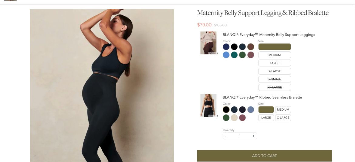
How BLANQI uses Bundle as Product
BLANQI make it easy for their shoppers to find complete maternity sets. While shoppers receive a fast, single-click shopping experience, BLANQI enjoys higher order amounts without investing any additional resources.
Offer shoppers the ability to create their own bundle of products by selecting from a range of available options
What is Build Your Own Bundle?
Build Your Own Bundle scenario provides shoppers with the flexibility to select specific items or features that best meet their individual needs and preferences. The selection is based on a pre-curated set of products by the merchant.
Why are brands using it?
Increase AOV - encourage higher spending with customizable bundles, raising average order values and revenue
Personalize purchases - tailor products to customer preferences, potentially increasing Average Order Value (AOV) and overall revenue
Stand out competitively - offer a unique option, attracting customers looking for customized solutions
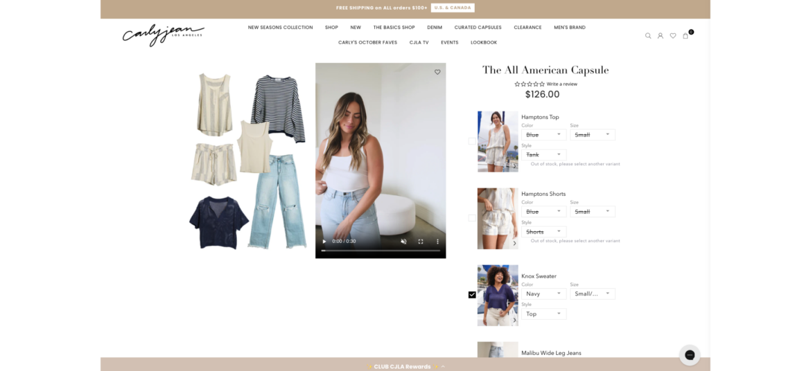
How Carly Jean uses Build Your Own Bundle
Carly Jean offers its shoppers the opportunity to build their own custom looks by selecting the individual items that comprise their desired outfit. 'Build Your Own Bundle' enables Carly Jean to easily provide a personalized experience that shoppers love and want to return to again and again.
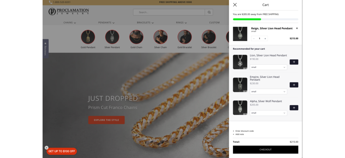
Encourage shoppers to spend a certain amount of money (X) in order to receive a specific benefit or reward (Y)
What is Spend X Get Y?
"Spend X, Get Y" promotions are designed to motivate shoppers to spend more money with the promise of receiving something valuable in return. It's a win-win situation where customers get a benefit, and the store increases its sales.
Why are brands using it?
Promotes larger purchases - motivates shoppers to spend more to qualify for the promotion, potentially leading to bigger transactions
Increases Average Order Value (AOV) - encourages higher spending, leading to a higher average transaction value
Proclamation Jewelry encourages its shoppers to spend at least $500 on jewelry in-store to receive free shipping. This is a win-win for both the shoppers, who get free shipping (which can be expensive at times), and the brand, which maintains a higher average order value.