Best Shopify theme for mobile: Mobile commerce (m-commerce) refers to the buying and selling of goods and services through handheld electronic devices like smartphones and tablets, and is a rapidly growing form of e-commerce. In fact, m-commerce sales are projected to increase by more than 22% to $3.56 trillion in 2021, and two out of every three dollars spent on online purchases today is done so through a mobile device.
If you’re running an e-commerce store, you can’t afford to neglect the huge industry of m-commerce. One of the best ways to ensure your store’s success is to use one of the many Shopify mobile first themes.
These themes are specifically designed to look great on smaller devices, and will make it easy for your customers to browse your store on any phone or tablet. If you’re looking for the best Shopify theme for mobile customers, here are 10 great options.
Why is Shopify Good for Mobile Commerce?
When you make the decision to start an online store, you have many e-commerce platforms to choose from. Shopify is one of the best platforms currently available, especially if you believe that many of your customers will be visiting your store from mobile devices.
Shopify has a large number of templates, or themes, you can choose from to form the skeleton of your online store. If you choose a theme that’s optimized for mobile (as many of Shopify’s are), you can be sure your customers will have a great shopping experience, regardless of their screen size.
How to Find the Best Shopify Themes for Mobile
All of the themes supported by Shopify are located on the Shopify theme store. You can visit the theme store to browse all of the latest themes, read reviews, check features, and often also explore a demo store for each theme.
Most themes will indicate whether they are mobile friendly, but you can also check out examples and sometimes also real stores using each theme. This way, you can view the content from a mobile device yourself and make sure you’re happy with how everything looks.
Handy is a mobile optimized Shopify theme specifically designed small screen experiences. This theme is ideal for all m-commerce customers and contains many great features that make it easy to navigate. Plus, there’s a search-focused menu that makes it easy for customers to search your store for products, tags, and more from their mobile device.
Why Handy is the best Shopify theme for mobile customers
If you’re looking for a Shopify theme mobile first design, Handy will likely meet your needs. It features a continuous product scroll, which is a great addition for mobile customers as they won’t have to click or swipe to view more products – they just keep appearing on the same page, improving your product discoverability.
Top features:
Quick link contact bar makes it easy to display contact info, store hours, and location
Custom promotion tiles allow you to promote sales, discounts, and featured products
Multi-column menu displays product images in a large, drop-down format
Reach is a playful theme with another mobile-first design. It comes in three unique styles, making it easily customizable to suit your brand and your products. Reach also offers eye-catching animations and icon styles that can be tailored to provide an engaging experience for your customers.
Why Reach is the best Shopify theme for mobile customers
Reach is a Shopify theme mobile customers will find intuitive and easy to navigate. Designed specifically for smaller devices and m-commerce, this theme allows you to share your story, products, and posts. It incorporates social media sharing, with icons to link your store to your Facebook, Twitter, or Instagram accounts.
Top features:
Tell your brand or product story with a dedicated “story” page linked in the header
Express is a free Shopify theme that allows you to create a simple e-commerce store with minimal time, effort, and experience. This is a mobile optimized Shopify theme for single-page stores, requiring little navigation and therefore making it ideal for mobile customers.
Why Express is the best Shopify theme for mobile customers
This simple theme requires little content and photography and is specifically designed for customers using smaller devices. It’s one of the top responsive Shopify themes thanks to features like a quick-buy function – customers can easily add items to their cart without having to leave the page they are on.
Top features:
Built for small catalogs and ideal for stores with a small number of menu items and products
Display multiple features collections directly from your home page
Slide-out cart allows customers to easily add items to their cart without leaving the product page
If you regularly feature promotions and specific products on your store, Envy might be the theme for you. As one of the best responsive Shopify themes, Envy is designed specifically for m-commerce and smaller devices. It features marketing popups that allow you to share promotional messages with your customers.
Why Envy is the best Shopify theme for mobile customers
Envy is among the top mobile Shopify themes and comes with a lot of great features, including four unique styles for superior customization. The product image zoom function provides your mobile customers with a closer look at your products (and extra product details) and gives a large-screen experience on a small device.
Top features:
Multi-level, drop-down menu makes store navigation easy
Advertise sales, promotions, or discounts at the top of your store’s home page
Tag images by dragging hot-spots for easier in-context product discovery
Do you have a story to tell? Context is a Shopify theme that makes it easy to get your brand’s message across using text and high-resolution photography of your products. It has a mobile friendly design that makes searching for products easy, and is suitable for stores with small, medium, or large catalogs.
Why Context is the best Shopify theme for mobile customers
Context allows mobile customers to easily search your store thanks to the predictive search feature – you can display live search results and quick links for products and store pages. It also offers product filtering, allowing customers to view products by brand, type, color, or size.
Top features:
Multi-column, drop-down menu facilitates easy store navigation
Story-focused product pages help to get your message across
Built-in social media icons allow customers to connect further with your brand
Avenue is designed to help customers on a mission – this mobile first theme makes it easy for customers to find specific products within your catalog. As such, it’s ideal for stores with a large number of products, and also features advanced product filtering by brand, type, and other options to help customers navigate your collections.
Why Avenue is the best Shopify theme for mobile customers
If you are trying to make a large catalog easily navigable for smaller devices, Avenue is a Shopify theme mobile customers will love. It also features a multi-product order form that promotes upselling and increases cart value by allowing customers to add different products to their cart simultaneously.
Top features:
Collection sub-listing allows collection tiles and breadcrumbs within another collection
Use color swatches on your home page to showcase available product colors
Engage local shoppers by showing product pickup availability
Galleria is another theme that’s ideal for large inventories and (as the name suggests) is image-centric to captivate your audience. Galleria is among the top Shopify mobile first themes and comes with some great customizable features, including three unique styles and two menu options (choose from a slide-out sidebar or a large horizontal menu).
Why Galleria is the best Shopify theme for mobile customers
Galleria is one of the most eye-catching mobile Shopify themes available. Your mobile customers will be instantly engaged thanks to the sleek vertical slideshow you can create on your home page to display information or product images. Large collections are also easily navigable on mobile devices thanks to the collection filtering options, allowing customers to view products by brand, type, and more.
Top features:
Quick view lets customers view product details in a popup without leaving the page
Home and product page videos allow you to get your story across
Display color swatches on your product page to showcase available product colors
ShowTime is another Shopify theme mobile customers will appreciate, and is also great for stores with varied brand and product content. It has some great mobile first features, including product filtering options that allow customers to filter products by type and sort by best sellers or price on your collection pages.
Why ShowTime is the best Shopify theme for mobile customers
ShowTime is one of the best mobile Shopify themes and is ideal for making even the largest of catalogs easy to navigate on a small device. Thanks to intuitive drop-down multi-column menus and product filtering options, your mobile customers won’t be missing out on any of the features when viewing your store on a small screen.
Top features:
Engage your customers with videos on your home and product pages
Product quick-view feature allows customers to see product details in a popup
Display products from multiple collections on your home page to make browsing easy
Streamline is one of the best Shopify mobile first themes when it comes to engaging your customers instantly. This theme comes in three unique styles and has a mobile-first design that will give your content a big impact on even the smallest screen.
Why Streamline is the best Shopify theme for mobile customers
Streamline offers a sticky checkout, which makes it easy for mobile customers to keep an eye on their cart without having to leave the page they’re on. Mobile customers can also filter products by brand, type, color, or size on your collection pages.
Top features:
Use animated content to make your content stand out on multiple store pages
Tell your product and brand story with additional text and images on product pages
Product pages can be loaded in advance for quick shopping
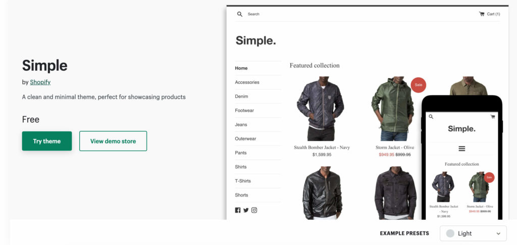
Simple is a free theme, designed by the team at Shopify. Although free, this theme has a great selection of features that will elevate your store. As well as being optimized for mobile visitors, Simple really supports images and is all about putting your products front and center.
Why Simple is the best Shopify theme for mobile customers
If you’re on a budget or just getting started on Shopify, Simple is a great place to start. This theme features an accordion-style menu that makes navigation a breeze, whether your customers are shopping via a small or large screen.
Top features:
Product image zoom gives customers a closer look at your products
Add PickyStory to Your Mobile Shopify Theme to Generate More Revenue
Adding apps to your Shopify store is a great way to increase conversions and boost revenue. Once you’ve chosen from the best mobile Shopify themes, consider adding upselling apps like PickyStory to your store. With PickyStory, you can easily generate more revenue from each store visit by featuring deals your customers won’t be able to turn down.
Use PickyStory to feature attractive deals like product bundles, product kits, and Shop the Look, each of which will encourage your customers to add extra items to their cart before checking out. You can also offer automated bundles and tempting discounts when your customers purchase products together.
Present bundles of products that are frequently purchased together, simplifying the decision-making process for your customers
What is Frequently Bought Together?
It is a recommendation scenario that suggests additional products to the shopper, which are often purchased by other customers in conjunction with the item they are currently viewing or considering purchasing.
Why are brands using it?
Boosted sales and revenue - increases average order value by suggesting complementary products, leading to higher sales
Simplified customer experience - saves time and effort for customers by offering relevant product recommendations, enhancing satisfaction and loyalty
Cross-selling opportunities: "Frequently Bought Together" creates opportunities for cross-selling, allowing brands to introduce shoppers to a wider range of products
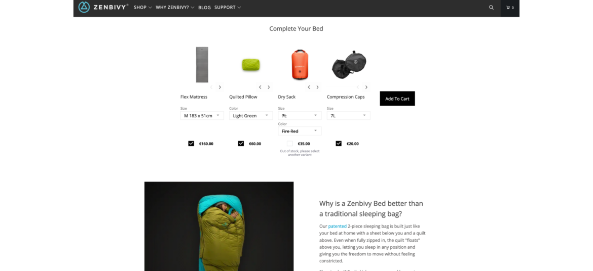
How Zenbivy uses Frequently Bought Together
Zenbivy simplifies the shopping experience by displaying all the needed pieces of its sleeping systems on one page, under each product that is part of a sleeping system. This way, shoppers don't need to go through multiple pages and guess what goes with what. Zenbivy enjoys much larger orders, and shoppers can have a seamless experience.
Offer shoppers the ability to create their own bundle of products by selecting from a range of available options
What is Build Your Own Bundle?
Build Your Own Bundle scenario provides shoppers with the flexibility to select specific items or features that best meet their individual needs and preferences. The selection is based on a pre-curated set of products by the merchant.
Why are brands using it?
Increase AOV - encourage higher spending with customizable bundles, raising average order values and revenue
Personalize purchases - tailor products to customer preferences, potentially increasing Average Order Value (AOV) and overall revenue
Stand out competitively - offer a unique option, attracting customers looking for customized solutions
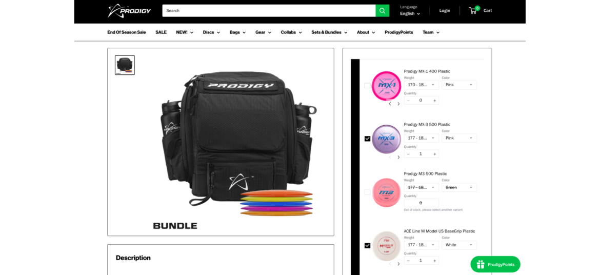
How Prodigy uses Build Your Own Bundle
Prodigy enables its shoppers to build their own bundle of golf discs, fully personalizing the shopping experience. Shoppers get an easy way to select their favorite discs while Prodigy consistently increases its AOV.
Combine multiple individual products into a bundle and sell them as a single unit
What is Bundle as Product?
Bundle as Product scenario involves bundling multiple individual products together and selling them as a single unit. This strategy offers shoppers a curated selection of items that work together or complement each other.
Why are brands using it?
Increase sales and revenue. Bundling leads to higher sales volumes and greater revenue due to the perceived cost-effectiveness.
Highlight the value and convenience of purchasing a set of items together, enticing them with an irresistible offer
Enhance value perception. Bundles create the perception of added value, making them more appealing to customers.
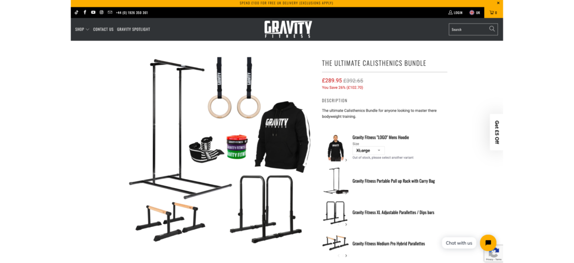
How Gravity Fitness uses Bundle as Product
Gravity Fitness knows that it's not an easy task for shoppers to collect all the required pieces for a complete home gym. That's why they have created pre-made home gym bundles for an easy shopping experience. Now they have fewer SKU issues, a higher AOV, and happier customers.
Encourage shoppers to add the missing items to complete the bundle when they add items to cart
What is Complete the Bundle?
Complete the Bundle popup is a deal that appears when a shopper has added some items to their shopping cart but has not yet added all the recommended or related products that typically go together.
Why are brands using it?
Increase Average Order Value (AOV) - encourage shoppers to add complementary products, leading to higher total purchases
Highlight the value and convenience of purchasing a set of items together, enticing them with an irresistible offer
Enhance value perception. Bundles create the perception of added value, making them more appealing to customers.
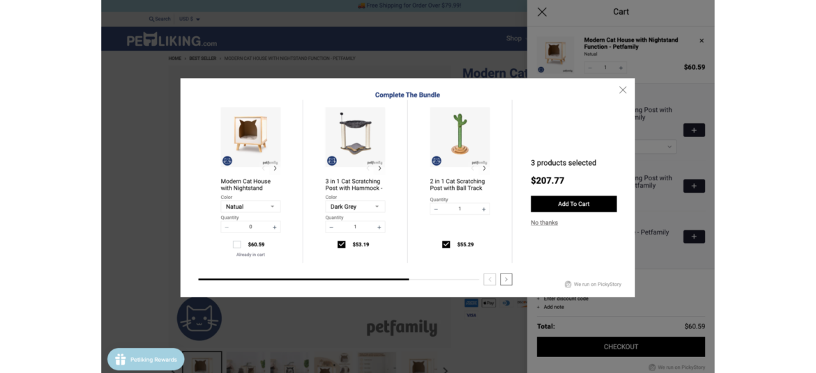
How Petliking.com uses Complete the Bundle
Petliking.com never misses an opportunity to offer more products to its shoppers after they add an item to cart. By offering to complete the bundle, Petliking.com helps shoppers to discover additional related items that complement each other while increasing its order size.
Combine multiple individual products into a bundle and sell them as a single unit
What is Bundle as Product?
Bundle as Product scenario involves bundling multiple individual products together and selling them as a single unit. This strategy offers shoppers a curated selection of items that work together or complement each other.
Why are brands using it?
Increase sales and revenue. Bundling leads to higher sales volumes and greater revenue due to the perceived cost-effectiveness.
Highlight the value and convenience of purchasing a set of items together, enticing them with an irresistible offer
Enhance value perception. Bundles create the perception of added value, making them more appealing to customers.
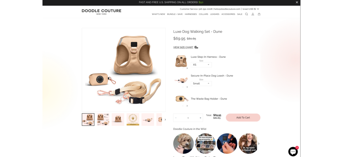
How Doodle Couture uses Bundle as Product
Doodle Couture makes it so easy for shoppers to equip their best friend with the required outfit. Instead of moving back and forth between pages, Doodle Couture offer a complete bundle for pets on one page with a single click. This boosts AOV while making the shopper happy.
Encourage shoppers to add the missing items to complete the bundle when they add items to cart
What is Complete the Bundle?
Complete the Bundle popup is a deal that appears when a shopper has added some items to their shopping cart but has not yet added all the recommended or related products that typically go together.
Why are brands using it?
Increase Average Order Value (AOV) - encourage shoppers to add complementary products, leading to higher total purchases
Highlight the value and convenience of purchasing a set of items together, enticing them with an irresistible offer
Enhance value perception. Bundles create the perception of added value, making them more appealing to customers.
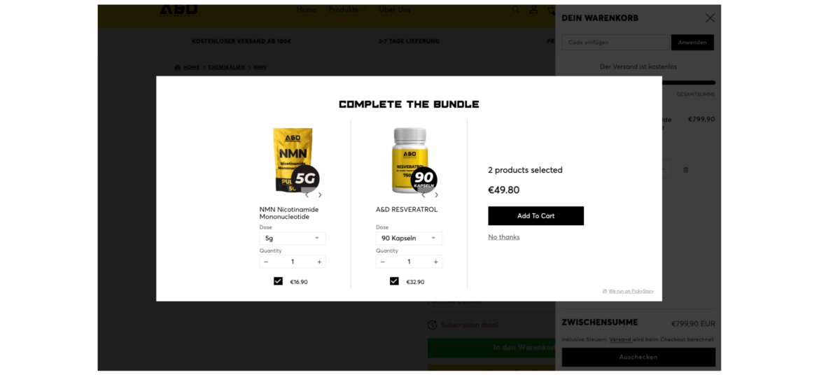
How A&D Performance uses Complete the Bundle
A&D Performance always seizes intent-based opportunities to offer additional supplements when shoppers add items to their cart. By displaying a 'Complete the Bundle' popup, A&D Performance increases their Average Order Value (AOV) while helping their customers discover more products.
Combine multiple individual products into a bundle and sell them as a single unit
What is Bundle as Product?
Bundle as Product scenario involves bundling multiple individual products together and selling them as a single unit. This strategy offers shoppers a curated selection of items that work together or complement each other.
Why are brands using it?
Increase sales and revenue. Bundling leads to higher sales volumes and greater revenue due to the perceived cost-effectiveness.
Highlight the value and convenience of purchasing a set of items together, enticing them with an irresistible offer
Enhance value perception. Bundles create the perception of added value, making them more appealing to customers.
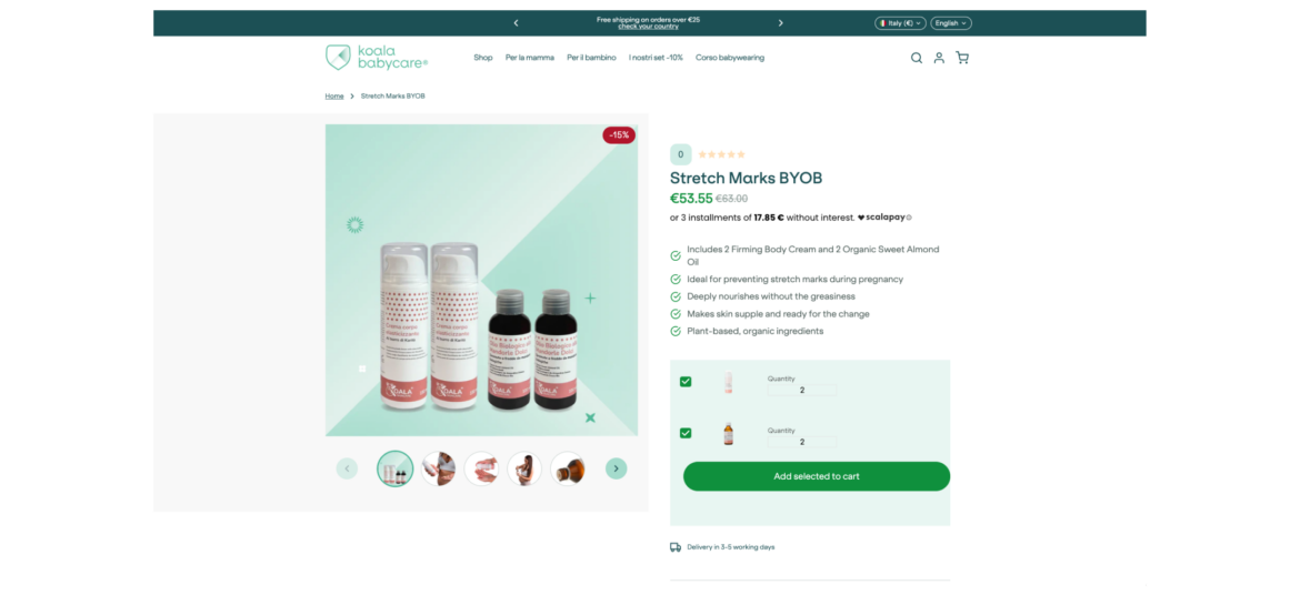
How Koala Babycare uses Bundle as Product
Koala Babycare simplifies its shoppers lives by offering complete cream & oil sets. Shoppers can easily pick their favorite bundles and save while Koala Babycare increases its AOV and number of orders.
Encourage shoppers to spend a certain amount of money (X) in order to receive a specific benefit or reward (Y)
What is Spend X Get Y?
"Spend X, Get Y" promotions are designed to motivate shoppers to spend more money with the promise of receiving something valuable in return. It's a win-win situation where customers get a benefit, and the store increases its sales.
Why are brands using it?
Promotes larger purchases - motivates shoppers to spend more to qualify for the promotion, potentially leading to bigger transactions
Increases Average Order Value (AOV) - encourages higher spending, leading to a higher average transaction value
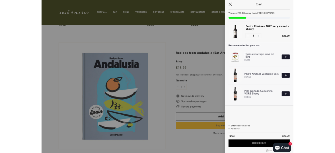
Jose Pizarro takes advantage of PickyCart and 'Spend X Get Y' to reward shoppers with free shipping when they spend £75 in-store. This is a win-win offer for both sides - while Jose Pizarro increases the AOV, shoppers receive a sweet reward.
Encourage shoppers to add the missing items to complete the bundle when they add items to cart
What is Complete the Bundle?
Complete the Bundle popup is a deal that appears when a shopper has added some items to their shopping cart but has not yet added all the recommended or related products that typically go together.
Why are brands using it?
Increase Average Order Value (AOV) - encourage shoppers to add complementary products, leading to higher total purchases
Highlight the value and convenience of purchasing a set of items together, enticing them with an irresistible offer
Enhance value perception. Bundles create the perception of added value, making them more appealing to customers.
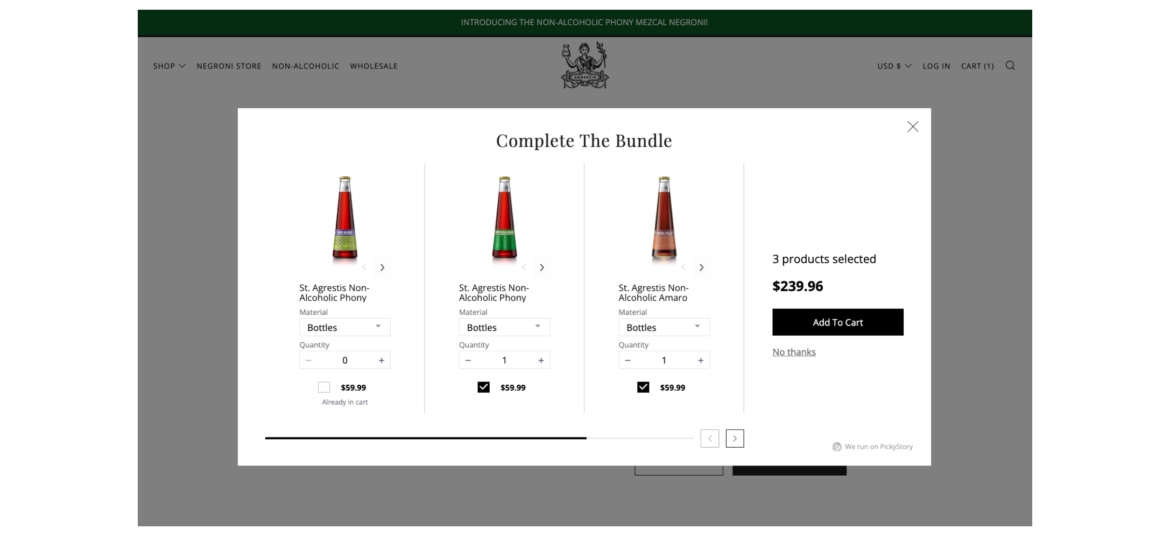
How Agrestis uses Complete the Bundle
Agrestis makes sure to consistently display a variety of spirits to their shoppers at the right moment. As shoppers add spirits to the cart, Agrestis extends an offer to include more related spirits, resulting in an improved shopping experience and a higher Average Order Value (AOV).
Offer shoppers the ability to create their own bundle of products by selecting from a range of available options
What is Build Your Own Bundle?
Build Your Own Bundle scenario provides shoppers with the flexibility to select specific items or features that best meet their individual needs and preferences. The selection is based on a pre-curated set of products by the merchant.
Why are brands using it?
Increase AOV - encourage higher spending with customizable bundles, raising average order values and revenue
Personalize purchases - tailor products to customer preferences, potentially increasing Average Order Value (AOV) and overall revenue
Stand out competitively - offer a unique option, attracting customers looking for customized solutions
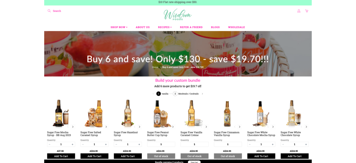
How Wisdom Foods uses Build Your Own Bundle
Wisdom Foods wanted to upgrade its shopping experience by making it easy for shoppers to pick their desired syrups. Now it allows shoppers to build their own bundles of syrups from a single page and checking out. This increases Wisdom Foods' order sizes while providing a personalized experience to their shoppers.
Combine multiple individual products into a bundle and sell them as a single unit
What is Bundle as Product?
Bundle as Product scenario involves bundling multiple individual products together and selling them as a single unit. This strategy offers shoppers a curated selection of items that work together or complement each other.
Why are brands using it?
Increase sales and revenue. Bundling leads to higher sales volumes and greater revenue due to the perceived cost-effectiveness.
Highlight the value and convenience of purchasing a set of items together, enticing them with an irresistible offer
Enhance value perception. Bundles create the perception of added value, making them more appealing to customers.
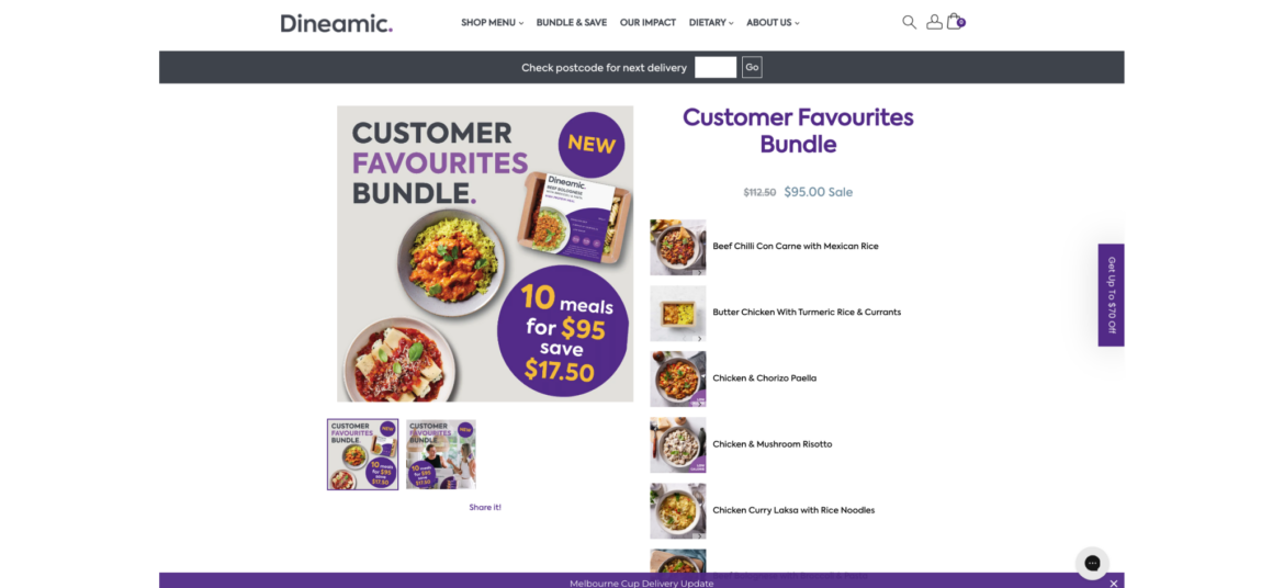
How Dineamic uses Bundle as Product
Dineamic takes advantage of bundles to package their pre-made meals by dietary requirements, so every shopper can quickly and easily find the desired category of meals and add them all with a single click. This simplifies the shopping experience and benefits both sides, as Dineamic boosts its Average Order Value (AOV).
Combine multiple individual products into a bundle and sell them as a single unit
What is Bundle as Product?
Bundle as Product scenario involves bundling multiple individual products together and selling them as a single unit. This strategy offers shoppers a curated selection of items that work together or complement each other.
Why are brands using it?
Increase sales and revenue. Bundling leads to higher sales volumes and greater revenue due to the perceived cost-effectiveness.
Highlight the value and convenience of purchasing a set of items together, enticing them with an irresistible offer
Enhance value perception. Bundles create the perception of added value, making them more appealing to customers.
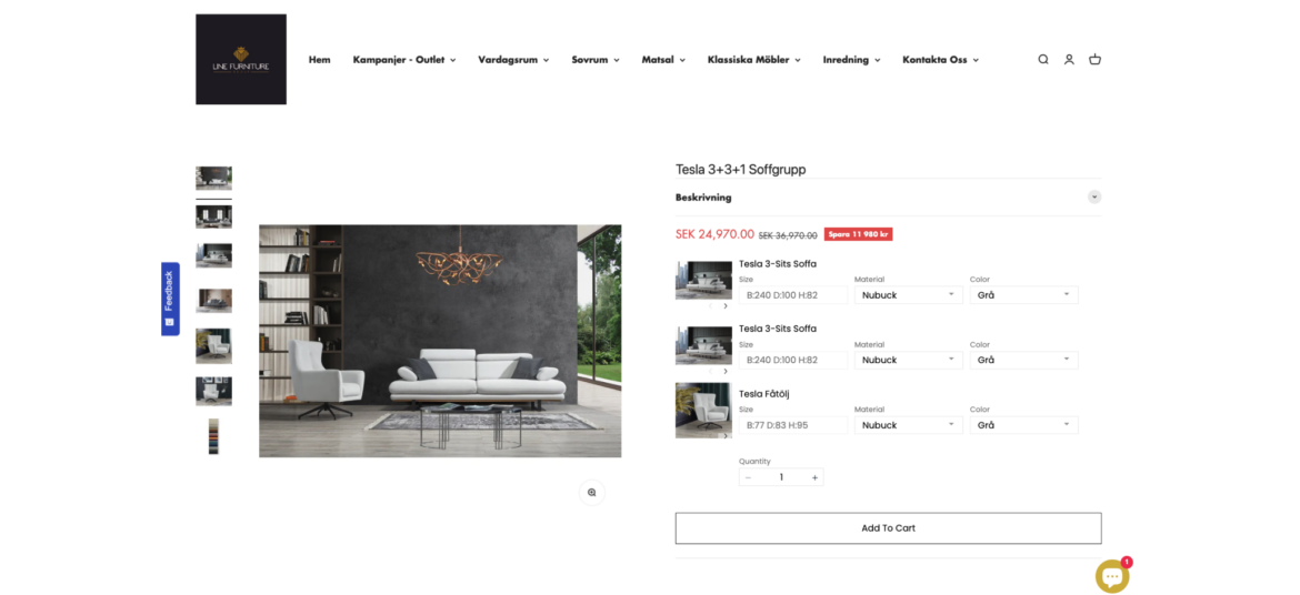
How Line Furniture uses Bundle as Product
Line furniture simplifies its shoppers lives by offering complete furniture sets in different styles. Now shoppers can easily find their favorite living room and save while Line Furniture increases its AOV and number of orders.
Encourage shoppers to add the missing items to complete the bundle when they add items to cart
What is Complete the Bundle?
Complete the Bundle popup is a deal that appears when a shopper has added some items to their shopping cart but has not yet added all the recommended or related products that typically go together.
Why are brands using it?
Increase Average Order Value (AOV) - encourage shoppers to add complementary products, leading to higher total purchases
Highlight the value and convenience of purchasing a set of items together, enticing them with an irresistible offer
Enhance value perception. Bundles create the perception of added value, making them more appealing to customers.
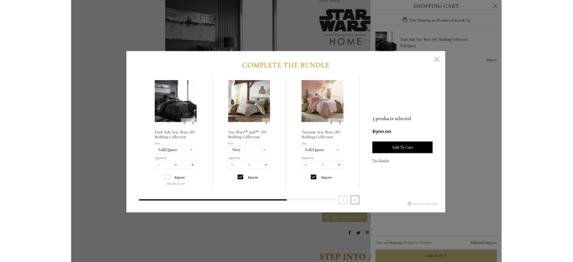
How Sobel Home uses Complete the Bundle
Sobel Home never misses an opportunity to offer more products to its shoppers after they add an item to cart. By offering to complete the bundle, Sobel Home helps shoppers to discover additional related items that complement each other while increasing its order size.
Present bundles of products that are frequently purchased together, simplifying the decision-making process for your customers
What is Frequently Bought Together?
It is a recommendation scenario that suggests additional products to the shopper, which are often purchased by other customers in conjunction with the item they are currently viewing or considering purchasing.
Why are brands using it?
Boosted sales and revenue - increases average order value by suggesting complementary products, leading to higher sales
Simplified customer experience - saves time and effort for customers by offering relevant product recommendations, enhancing satisfaction and loyalty
Cross-selling opportunities: "Frequently Bought Together" creates opportunities for cross-selling, allowing brands to introduce shoppers to a wider range of products
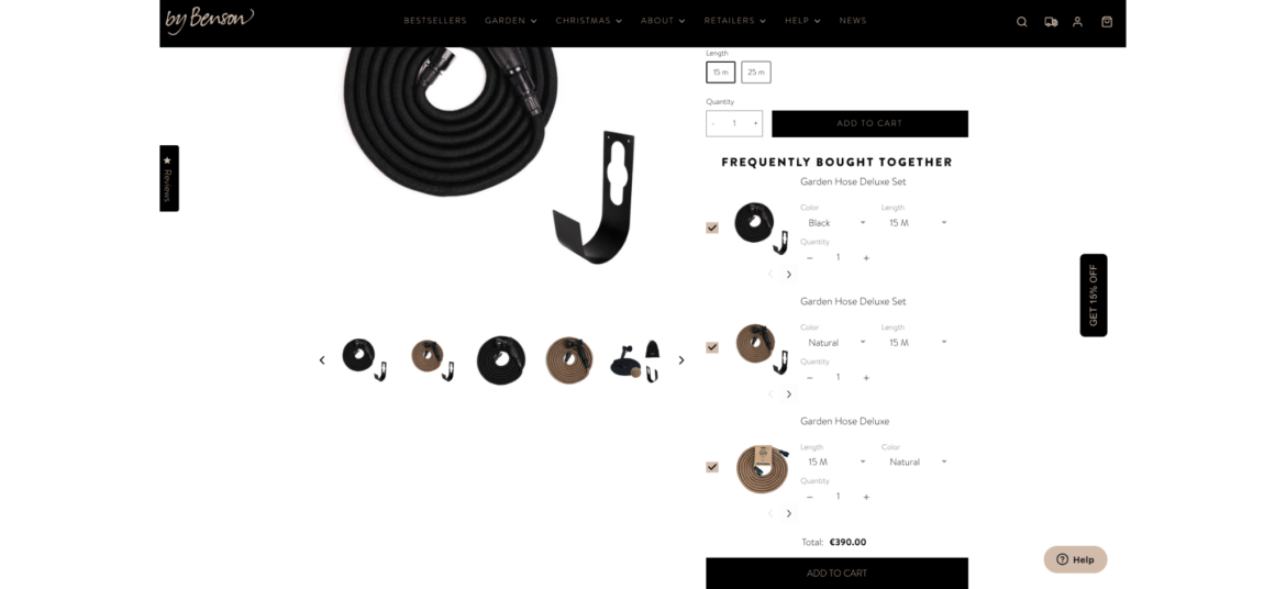
How By Benson uses Frequently Bought Together
By Benson never misses an opportunity to offer more options to its customers. While shoppers visit their product pages, they constantly offer to extend or upgrade the targeted product, resulting in better service and larger orders.
Offer shoppers the ability to create their own bundle of products by selecting from a range of available options
What is Build Your Own Bundle?
Build Your Own Bundle scenario provides shoppers with the flexibility to select specific items or features that best meet their individual needs and preferences. The selection is based on a pre-curated set of products by the merchant.
Why are brands using it?
Increase AOV - encourage higher spending with customizable bundles, raising average order values and revenue
Personalize purchases - tailor products to customer preferences, potentially increasing Average Order Value (AOV) and overall revenue
Stand out competitively - offer a unique option, attracting customers looking for customized solutions
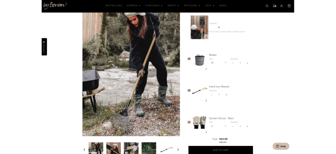
How By Benson uses Build Your Own Bundle
As a professional destination for home gardeners, By Benson understands that it might be tricky to select all the necessary tools to make your garden shine. That's why By Benson helps its shoppers choose bundles of tools with a single click, while boosting their Average Order Value (AOV).
Offer shoppers the ability to create their own bundle of products by selecting from a range of available options
What is Build Your Own Bundle?
Build Your Own Bundle scenario provides shoppers with the flexibility to select specific items or features that best meet their individual needs and preferences. The selection is based on a pre-curated set of products by the merchant.
Why are brands using it?
Increase AOV - encourage higher spending with customizable bundles, raising average order values and revenue
Personalize purchases - tailor products to customer preferences, potentially increasing Average Order Value (AOV) and overall revenue
Stand out competitively - offer a unique option, attracting customers looking for customized solutions
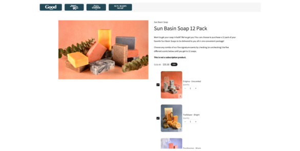
How Good Store uses Build Your Own Bundle
Good Store encourages its shoppers to build their own custom bundles of soaps. They provide a variety of soaps to choose from and leave the selection itself to the shopper. This is fun, rewarding, and makes both sides happy.
Combine multiple individual products into a bundle and sell them as a single unit
What is Bundle as Product?
Bundle as Product scenario involves bundling multiple individual products together and selling them as a single unit. This strategy offers shoppers a curated selection of items that work together or complement each other.
Why are brands using it?
Increase sales and revenue. Bundling leads to higher sales volumes and greater revenue due to the perceived cost-effectiveness.
Highlight the value and convenience of purchasing a set of items together, enticing them with an irresistible offer
Enhance value perception. Bundles create the perception of added value, making them more appealing to customers.
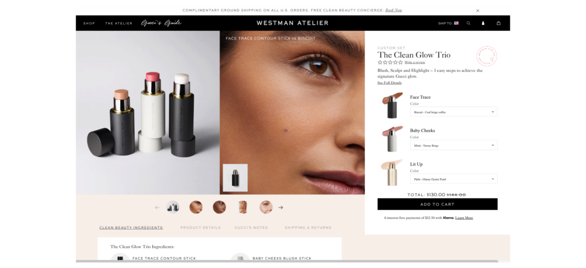
How Westman Atelier uses Bundle as Product
Westman Atelier understands that the attention span of the average shopper is quite short. Furthermore, with numerous options available, it's often easier to opt for a suggested bundle that's already curated for you.
Present bundles of products that are frequently purchased together, simplifying the decision-making process for your customers
What is Frequently Bought Together?
It is a recommendation scenario that suggests additional products to the shopper, which are often purchased by other customers in conjunction with the item they are currently viewing or considering purchasing.
Why are brands using it?
Boosted sales and revenue - increases average order value by suggesting complementary products, leading to higher sales
Simplified customer experience - saves time and effort for customers by offering relevant product recommendations, enhancing satisfaction and loyalty
Cross-selling opportunities: "Frequently Bought Together" creates opportunities for cross-selling, allowing brands to introduce shoppers to a wider range of products
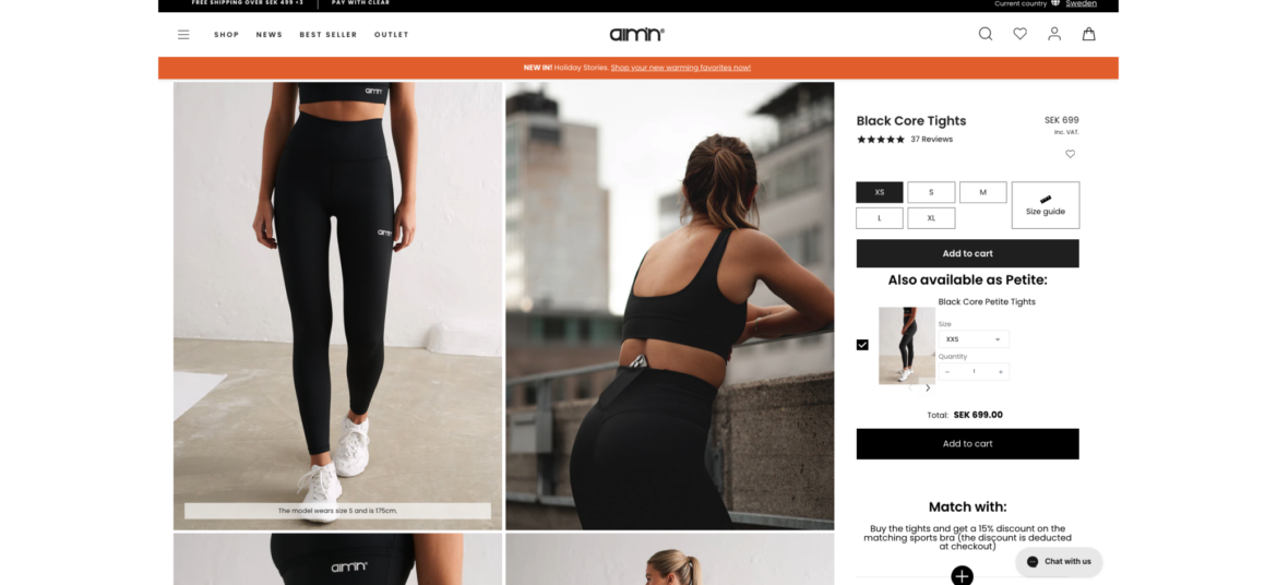
How Aim’n uses Frequently Bought Together
Aim'n never misses a shopper when it comes to its product pages. It utilizes the 'Frequently Bought Together' feature to suggest additional sizes to product viewers, ensuring that no shopper is left without a solution while keeping its main sizes as the default option.
Combine multiple individual products into a bundle and sell them as a single unit
What is Bundle as Product?
Bundle as Product scenario involves bundling multiple individual products together and selling them as a single unit. This strategy offers shoppers a curated selection of items that work together or complement each other.
Why are brands using it?
Increase sales and revenue. Bundling leads to higher sales volumes and greater revenue due to the perceived cost-effectiveness.
Highlight the value and convenience of purchasing a set of items together, enticing them with an irresistible offer
Enhance value perception. Bundles create the perception of added value, making them more appealing to customers.
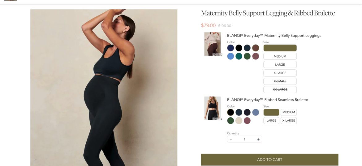
How BLANQI uses Bundle as Product
BLANQI make it easy for their shoppers to find complete maternity sets. While shoppers receive a fast, single-click shopping experience, BLANQI enjoys higher order amounts without investing any additional resources.
Offer shoppers the ability to create their own bundle of products by selecting from a range of available options
What is Build Your Own Bundle?
Build Your Own Bundle scenario provides shoppers with the flexibility to select specific items or features that best meet their individual needs and preferences. The selection is based on a pre-curated set of products by the merchant.
Why are brands using it?
Increase AOV - encourage higher spending with customizable bundles, raising average order values and revenue
Personalize purchases - tailor products to customer preferences, potentially increasing Average Order Value (AOV) and overall revenue
Stand out competitively - offer a unique option, attracting customers looking for customized solutions
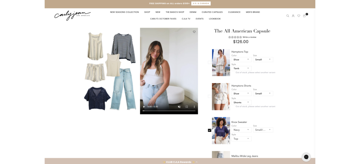
How Carly Jean uses Build Your Own Bundle
Carly Jean offers its shoppers the opportunity to build their own custom looks by selecting the individual items that comprise their desired outfit. 'Build Your Own Bundle' enables Carly Jean to easily provide a personalized experience that shoppers love and want to return to again and again.
Encourage shoppers to spend a certain amount of money (X) in order to receive a specific benefit or reward (Y)
What is Spend X Get Y?
"Spend X, Get Y" promotions are designed to motivate shoppers to spend more money with the promise of receiving something valuable in return. It's a win-win situation where customers get a benefit, and the store increases its sales.
Why are brands using it?
Promotes larger purchases - motivates shoppers to spend more to qualify for the promotion, potentially leading to bigger transactions
Increases Average Order Value (AOV) - encourages higher spending, leading to a higher average transaction value
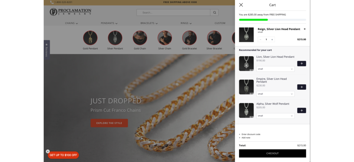
Proclamation Jewelry encourages its shoppers to spend at least $500 on jewelry in-store to receive free shipping. This is a win-win for both the shoppers, who get free shipping (which can be expensive at times), and the brand, which maintains a higher average order value.


-min")